 Magic Element | Portfolio of Dan Rodrigues
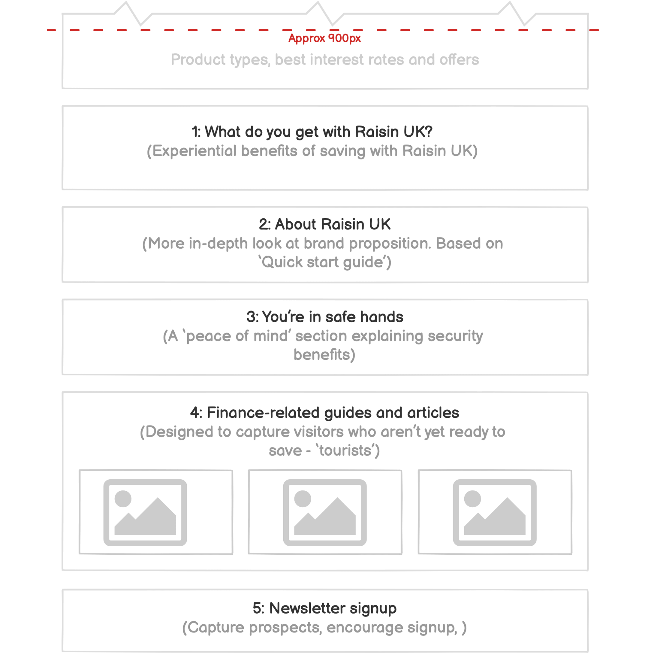
Below the fold
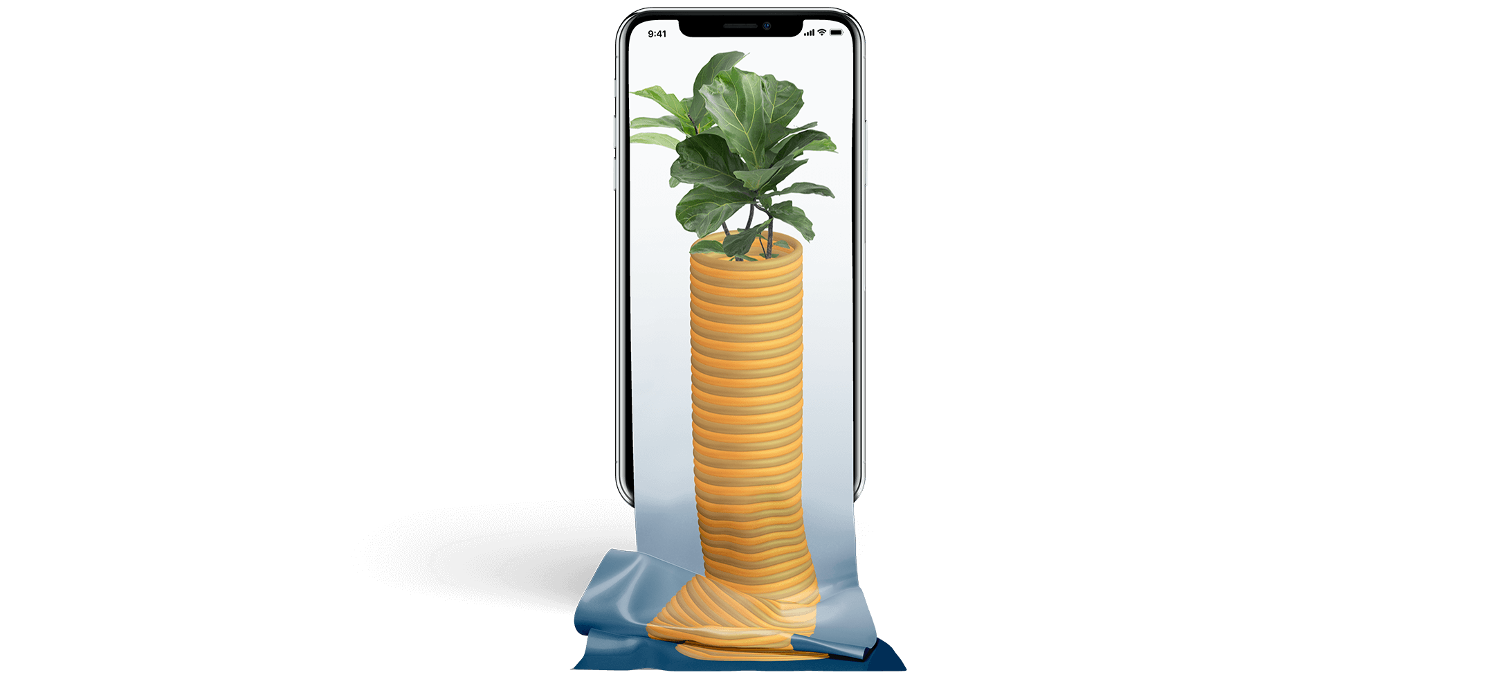
What lies beneath?
Having previously established a high-performing homepage hero for Raisin UK, I began work on the rest of the homepage; exploring and improving the content to drive CRO and optimise user experience, in response to the changing expectations of our customers.
![]() Date: 2021
Date: 2021
![]() Role: UX/UI Research & Design, WordPress CMS · Permanent
Role: UX/UI Research & Design, WordPress CMS · Permanent
![]() Team: Senior E-Commerce Manager (UK), Digital Marketing Manager (UK), Senior SEO Manager (Berlin), Senior Graphic Designer (Berlin)
Team: Senior E-Commerce Manager (UK), Digital Marketing Manager (UK), Senior SEO Manager (Berlin), Senior Graphic Designer (Berlin)
Information hierarchy
Using brand styles
Implementing the learnings we had gleaned from the homepage surveys undertaken previously, I wanted to maintain the same simple, clean look & feel below the fold. I used a limited colour palette picked from the brand style guide, along with brand iconography.
| Black 80 / Black 10 | |
| #404040 | #f3f3f3 |
| Blue 80 / Blue 10 | |
| #004b8c | #e8f0f9 |
| Paper | |
| #ffffff | |
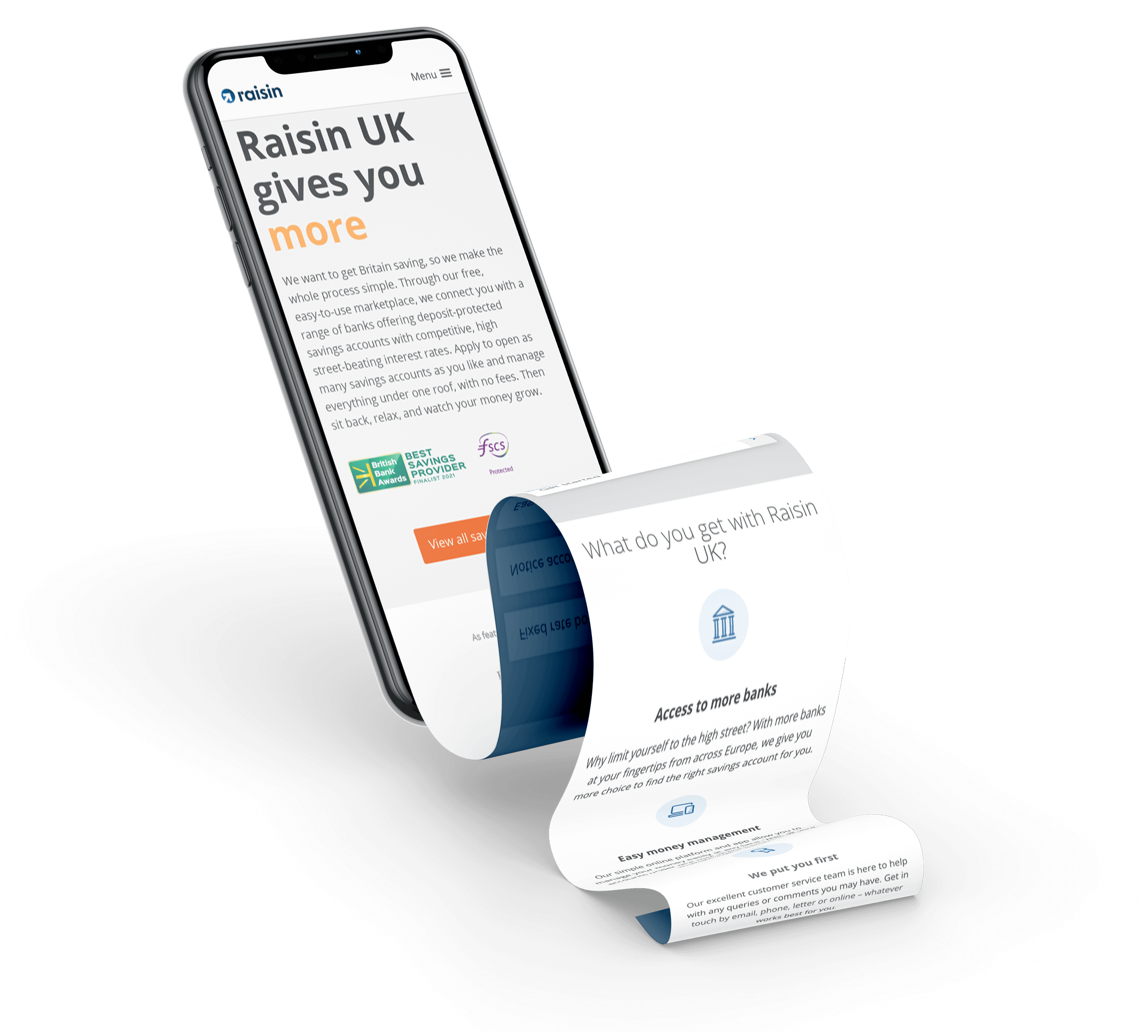
1: What do you get with Raisin UK?
Benefits of saving with Raisin UK
Immediately below the hero, trust elements and product descriptions, it was important that we explain what the key advantages of registering on the Raisin UK platform are and exactly how UK customers can benefit from these. From the numerous benefits we could select, we wanted to display just the 4 most important ones to help to minimise cognitive load, particularly for users who are unfamiliar with financial services, savings platforms and the terminology being used.
| Experience-related benefits | Security-related benefits |
|---|---|
| Competitive interest rates | Secure access |
| Easy and convenient | Small initial fund transfers |
| Access to more banks and building societies | Data encryption |
| Easy to manage money in one place | FSCS protection |
| Offers and bonuses available | FCA Regulated |
| Customer service |
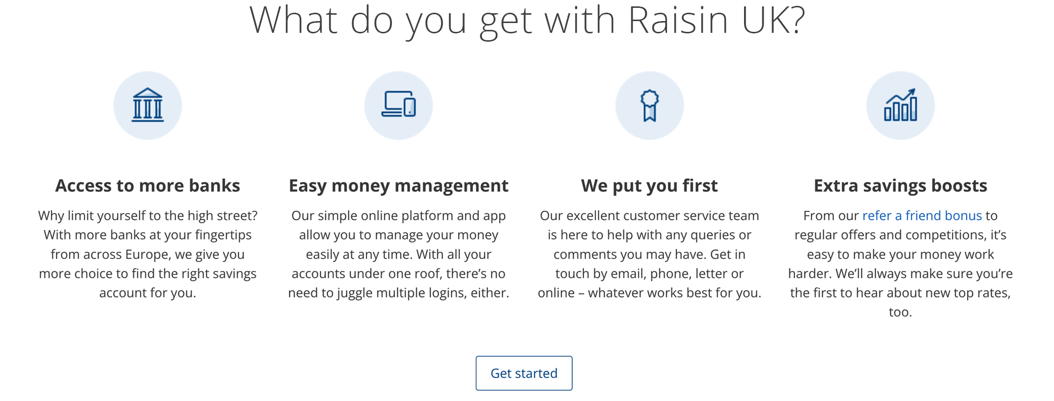
Condensing 4 experience-related benefits
From this list, it was obvious that that the main benefits fell into two categories; benefits relating to ease and positive customer experience and the others to addressing security-related concerns. By splitting out the security-related benefits and referring to them further down the page, we could focus this section purely on those benefits which related to the positive user experiences enjoyed when registered and saving with Raisin UK.
We were able to condense the experience-related benefits into the following 4 key sections:
- Access to more banks
- Easy money management
- We put you first
- Extra savings boosts
Below, you can see how the final banner displayed at screen widths above 1200px.
2: About Raisin UK
I wanted to base this section around our 'quick start guide'; one of our most visited pages. To condense the content and improve the customer experience, I proposed using video to relay the information. In this way, we would be able to place a lot of really useful information into a small amount space, whilst really engaging the viewer. The great thing about online video is that people vastly prefer watching over reading (just consider the last time you watched the news versus reading a newspaper!) It spans nearly every industry and demographic.
The power of video
If a picture is worth a thousand words, a product video could very well be worth a thousand sales. Considering that video now appears in 70% of the top 100 search results listings, and that viewers are anywhere from 64-85% more likely to buy after watching a product video - this is one marketing force you can't afford to ignore.
Sherice Jacob | Digital Entrepreneur and Business Coach. From neilpatel.com
Video is entertaining, visual, and drastically underused to convert leads. Having a video on your landing page can increase your conversion rate by 80%.
EyeWideDigital
Video engagement elsewhere on the Raisin UK website
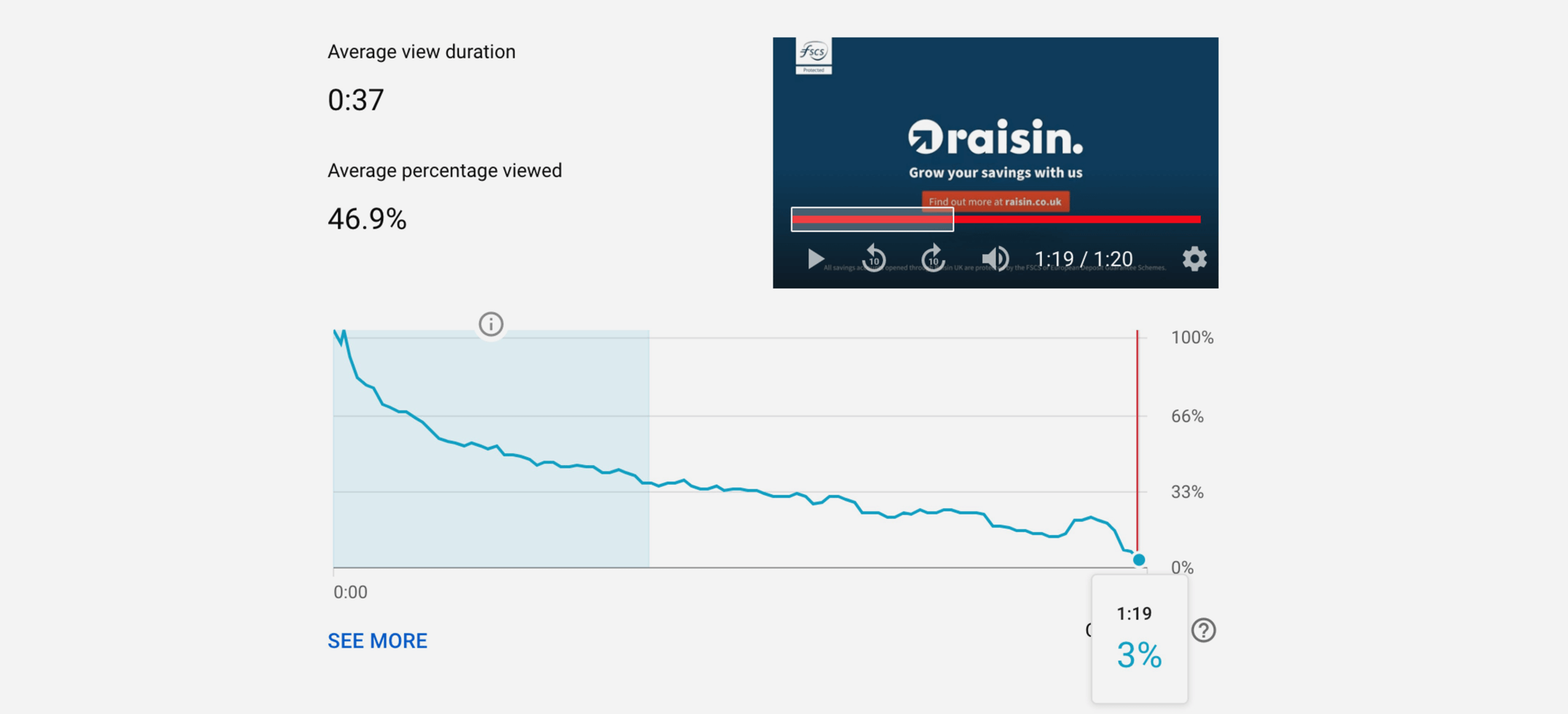
We could see that videos that were hosted elsewhere on the website were heavily engaged. 34% of viewers watched half of our longest, 80 second video. (Examples below showing engagement with our 30 and 80 second promotional videos).
30 second video
31% of viewers watch the full video
41% of viewers watch half of the video
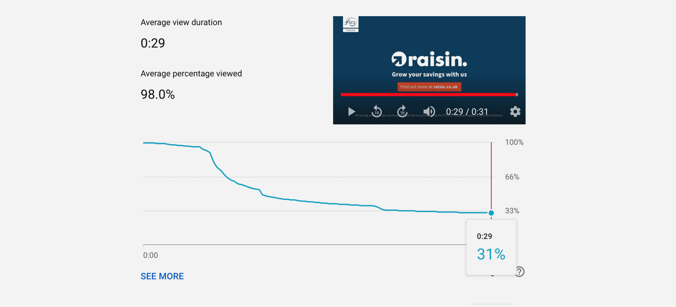
80 second video
3% of viewers watch the full video
34% of viewers watch half of the video
We hired a professional video company to create the 'About Raisin UK' video and we supplied their team with the creative assets, script and other assets they needed from Brand.
Click the image below to view the 'About Raisin' video on YouTube.
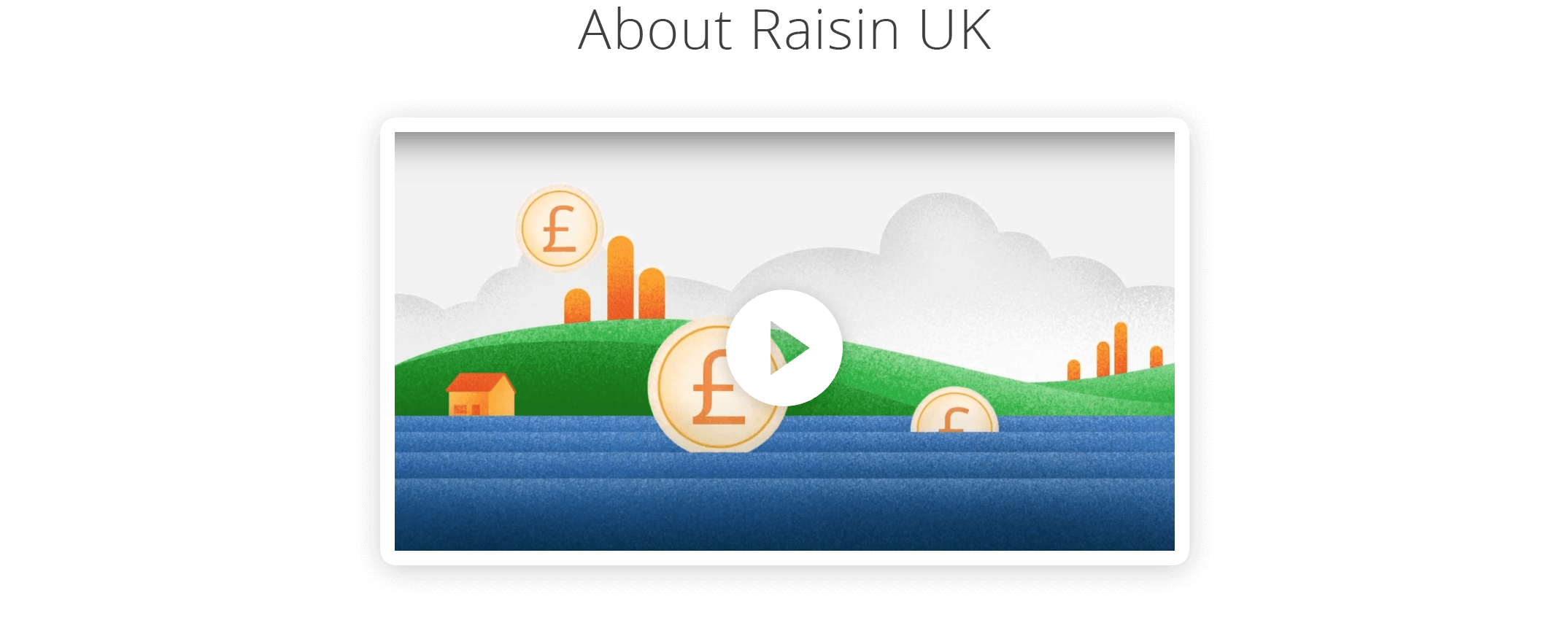
Results
The 'About Raisin UK' video has been a huge success, with almost 250,000 views during the first year.
- 19% of viewers watch the full video
- 48% of viewers watch half of the video
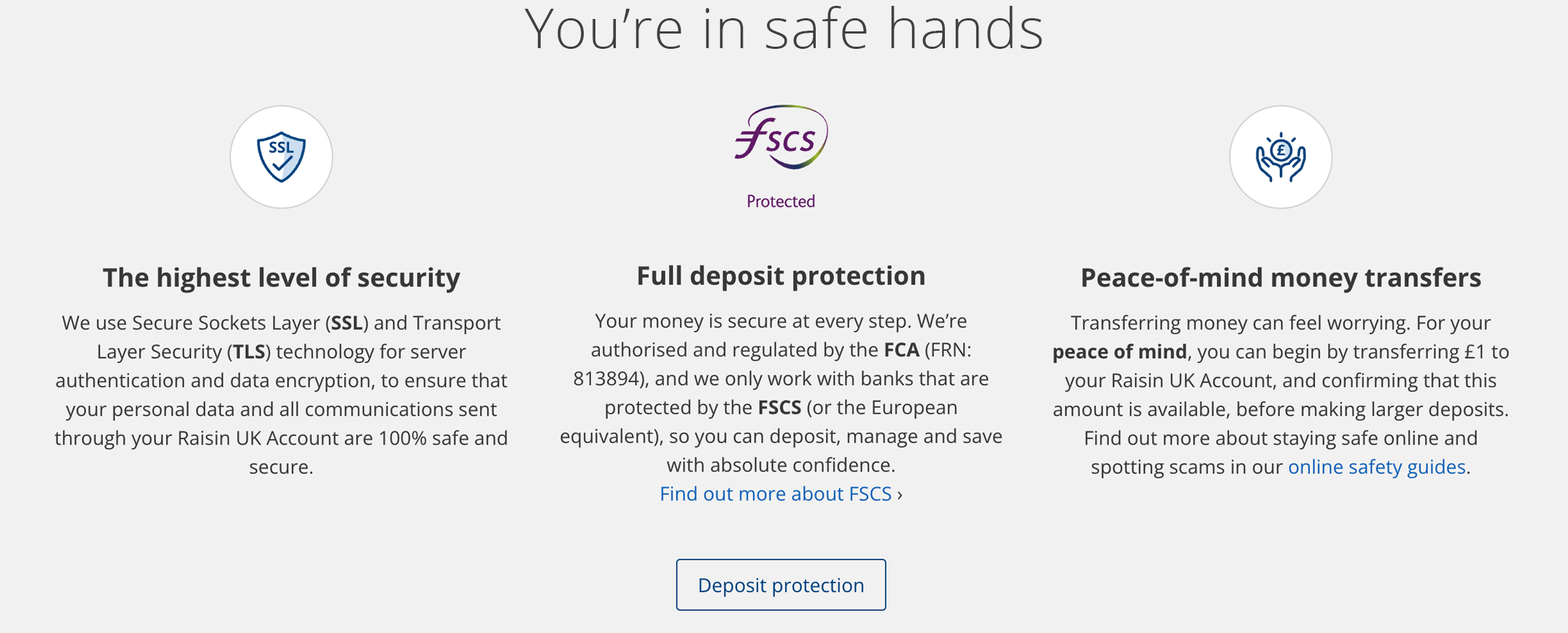
3: You're in safe hands
The original 'peace of mind' banner
We had known for a long time, that a main concern for our customers was knowing that savings their savings with Raisin UK are protected by the FSCS (Financial Services Compensation Scheme), therefore we had concentrated purely on displaying this reassurance on the homepage previously.
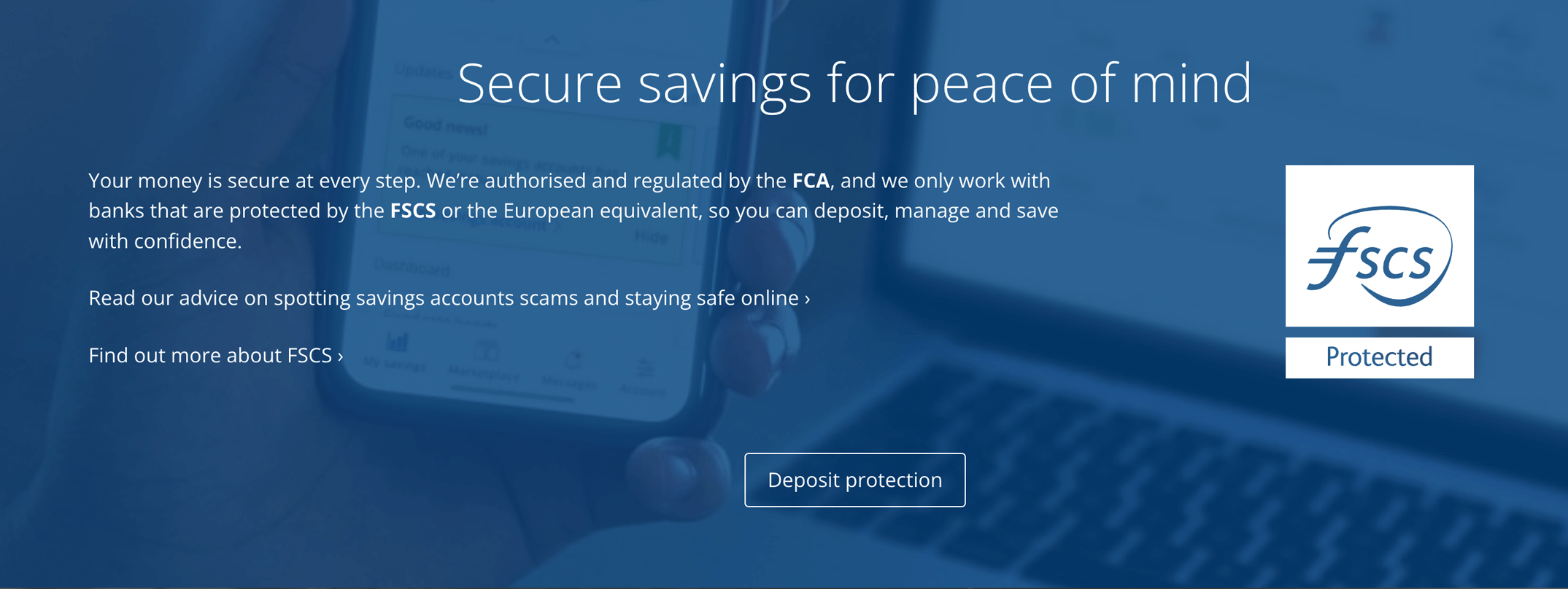
During the Covid-19 pandemic, we noticed that users were becoming increasingly nervous about online scams, particularly in relation to financial services. We had responded to this nervousness by introducing an 'Online safety hub', which featured informative articles about how to stay safe online, but I also felt that we could add value by displaying the security-related benefits of saving with Raisin UK to the homepage.
New iconography
I proposed expanding the function of the original 'peace of mind' section to also explain platform security, data encryption, small initial fund transfers and FCA regulation; all of which addressed genuine customer concerns.
I requested new icon designs from the Graphics Team to illustrate 'The highest level of security' and 'Peace-of-mind money transfers'.
I wanted to retain the instantly recognisable and reassuring FSCS logo to illustrate 'Full deposit protection'.
Below, you can see how the final 'peace of mind' banner displayed at screen widths above 1200px.
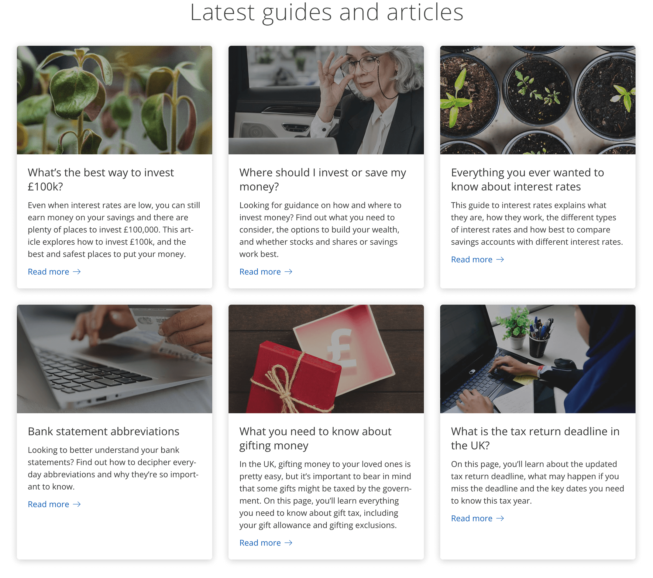
4: Latest guides and articles
In this section of the page I wanted to feature content which engaged 'information tourists'. These could be prospects who are not yet ready to save on the Raisin UK platform, but are nevertheless interested in engaging with financial information.
Working with our Berlin-based SEO Manager, I was able to recognise which six of our content hub pages were most heavily engaged with and then build info cards which linked out, from the homepage directly to these popular pages.
Raisin UK's content hub pages serve to answer questions and solve problems that our potential customers may have. For example: - ‘should i pay off my mortgage?’ (500 searches p/m) - ‘how much can i gift my children?’ (500 searches p/m). The goal of the content hub pages is to reveal the Raisin brand to more potential customers, build the topical authority of the website and support the category product pages, which are part of the site's transactional flows. The topics covered by the content hubs are ‘evergreen’, meaning they will never become irrelevant. Therefore adding links to the most popular pages, directly from the homepage is beneficial for both users and the business.
Below, you can see how the final 'peace of mind' banner looked at screen widths above 992px (in May 2022).
5: Newsletter signup
The original newsletter signup banner
The challenge here was to design a new newsletter signup mechanism that was more effective than the version that was currently displayed on the website. The existing signup banner didn't contain an input form, instead linking users through to a separate landing page where they could enter and submit their email address and be added to our subscriber inclusion list.
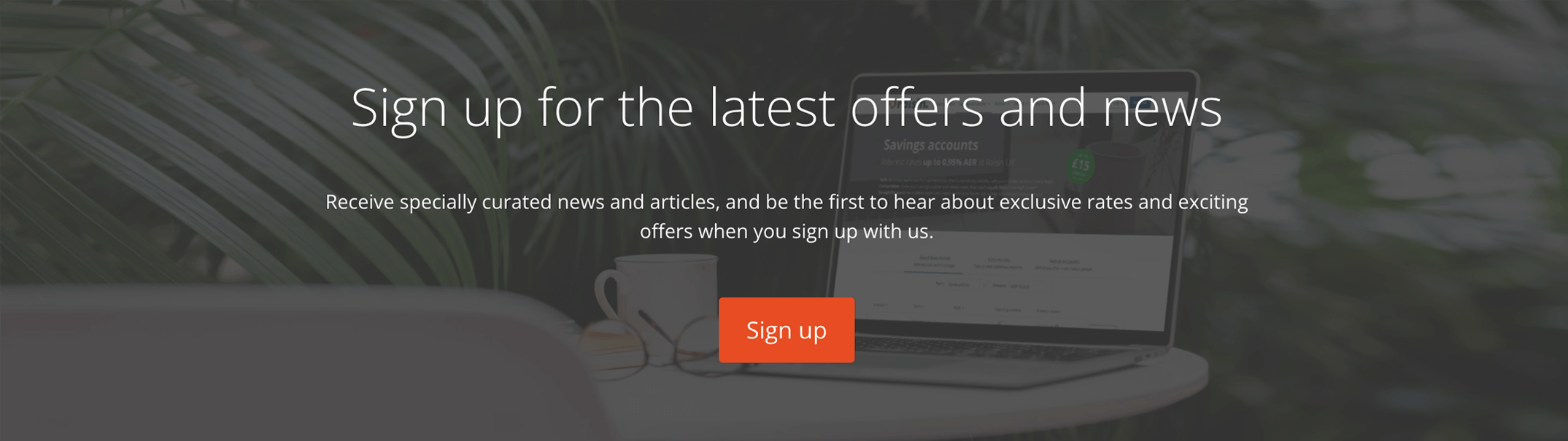
I recognised that asking users to click away from their intended journey posed an obstacle, so I wanted to design a banner which contained a simple on-page input form, removing the obstacle.
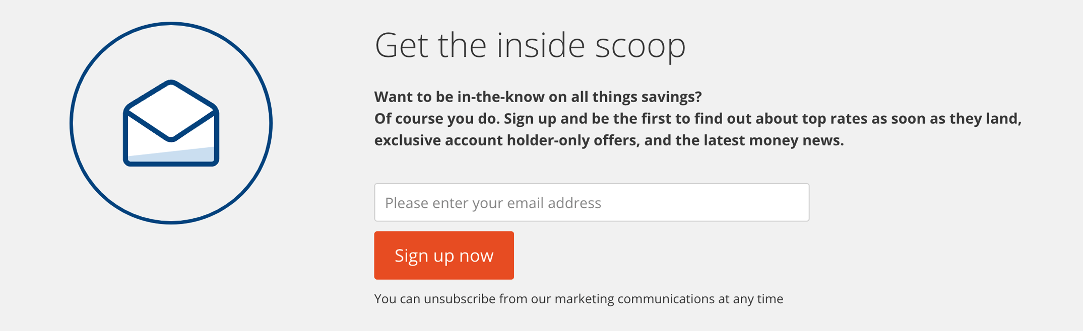
Research
I discovered a DMA (Data & Marketing Association) report showing that generally, 60% of users sign up for newsletters to receive offers and sales, so it became obvious that the wording in the new banner needed to explain that the information in our newsletters emphasised new interest rates and promotional bonuses on the Raisin UK website.
Research also revealed that signup banners which used creative, catchy titles were proven to get more click throughs. We experimented with several copy options until we agreed on the short, punchy title; "Get the inside scoop".
The design was brought totally on-brand by incorporating new iconography and the light grey background.
Below, you can see how the final newsletter signup banner displayed at screen widths above 1200px.
Results
Following the new subscription banner roll out, there was a marked increase in newsletter subscriptions.
- Homepage saw an average 119% increase in weekly subscriber numbers during a 4-week period
- Across the whole website we saw 190% increase in weekly subscriber numbers during the same period
The solution
Greater user engagement
- +9% of mobile users scrolling over 80%
- +16% of desktop users scrolling over 80%
- +6 CVR from the homepage
- Reduction in general CS enquiries
(we attribute this to the effectiveness of the the 'About Raisin UK' video and 'safe hands' banner) - Observable increase in engagement with the content hubs
(contributed to by the 'Latest guides and articles' section) - Huge increase in newsletter subscriptions
(Details above)
Want to know more?
If you would like to know more about my work, or have a new opportunity you want to share with me,
please email: