 Magic Element | Portfolio of Dan Rodrigues
Fintech homepage redesign
Who is Raisin
Berlin-based FinTech Raisin GmbH is a trailblazer for open banking in the deposits and investments space. Available in the US and across 28 European countries, Raisin is consistently named one of Europe’s top five FinTech’s and is backed by investors such as Goldman Sachs, Deutsche Bank and PayPal.
Raisin UK
In 2017, Raisin GmbH established their UK subsidiary and Raisin UK was born; a UK savings marketplace connecting savers with a range of banks offering deposit-protected savings accounts with competitive interest rates, making it easier for UK savers to grow their money.
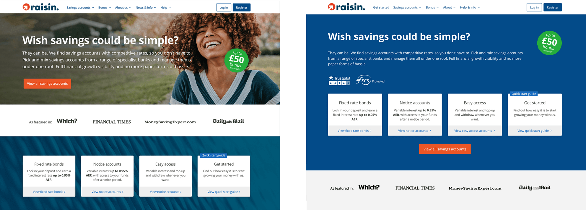
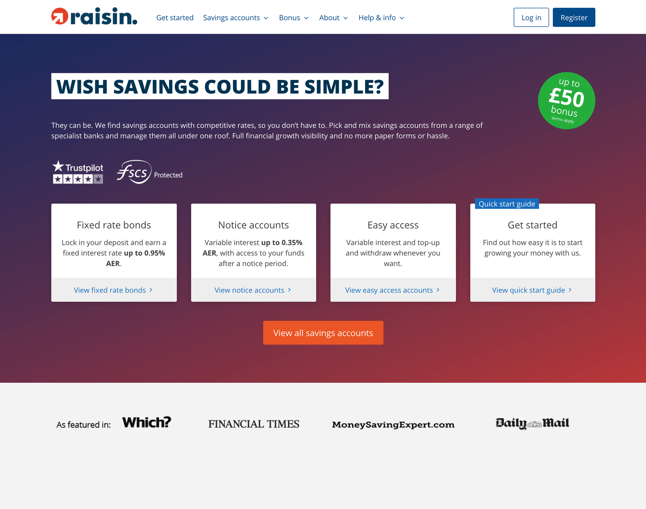
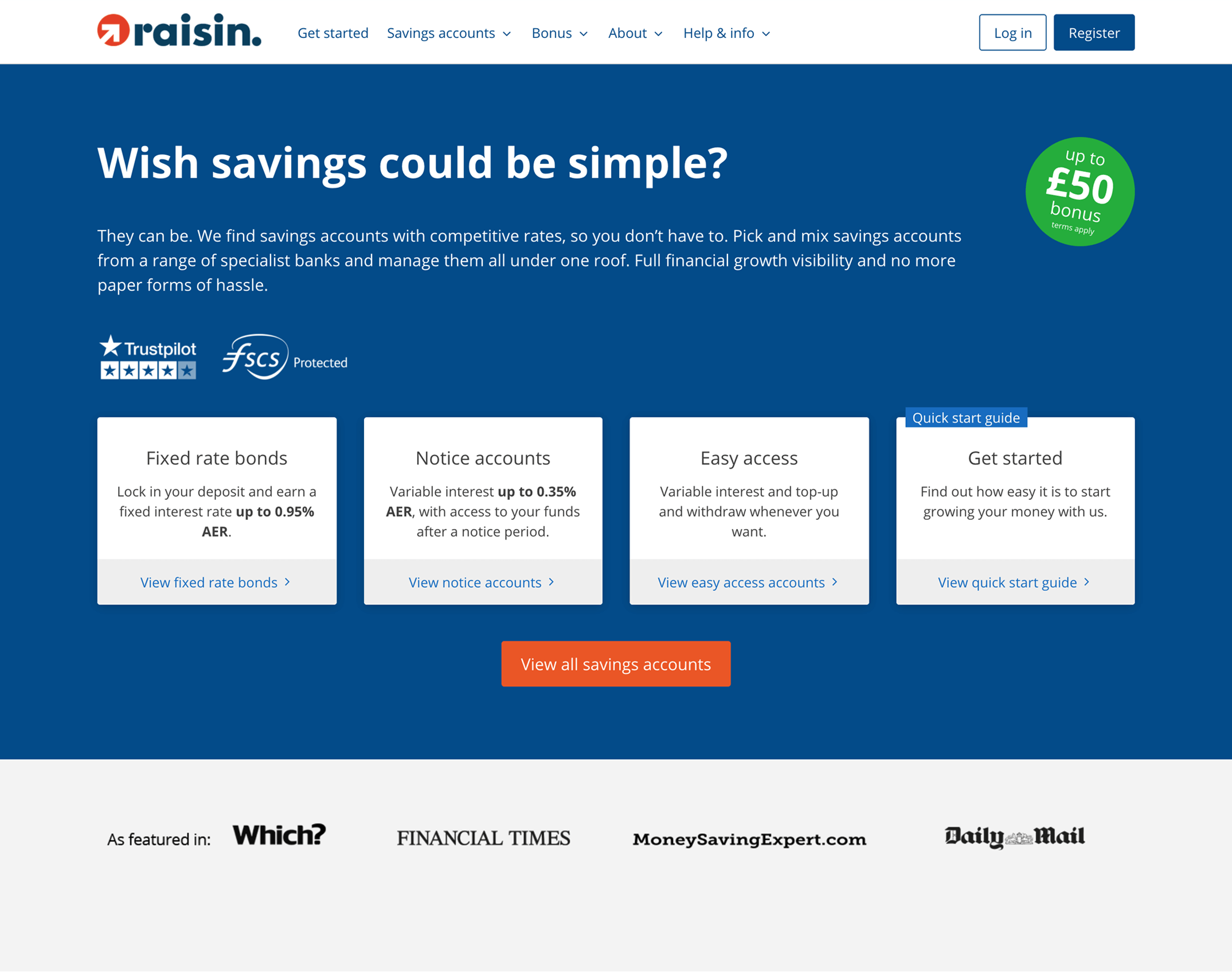
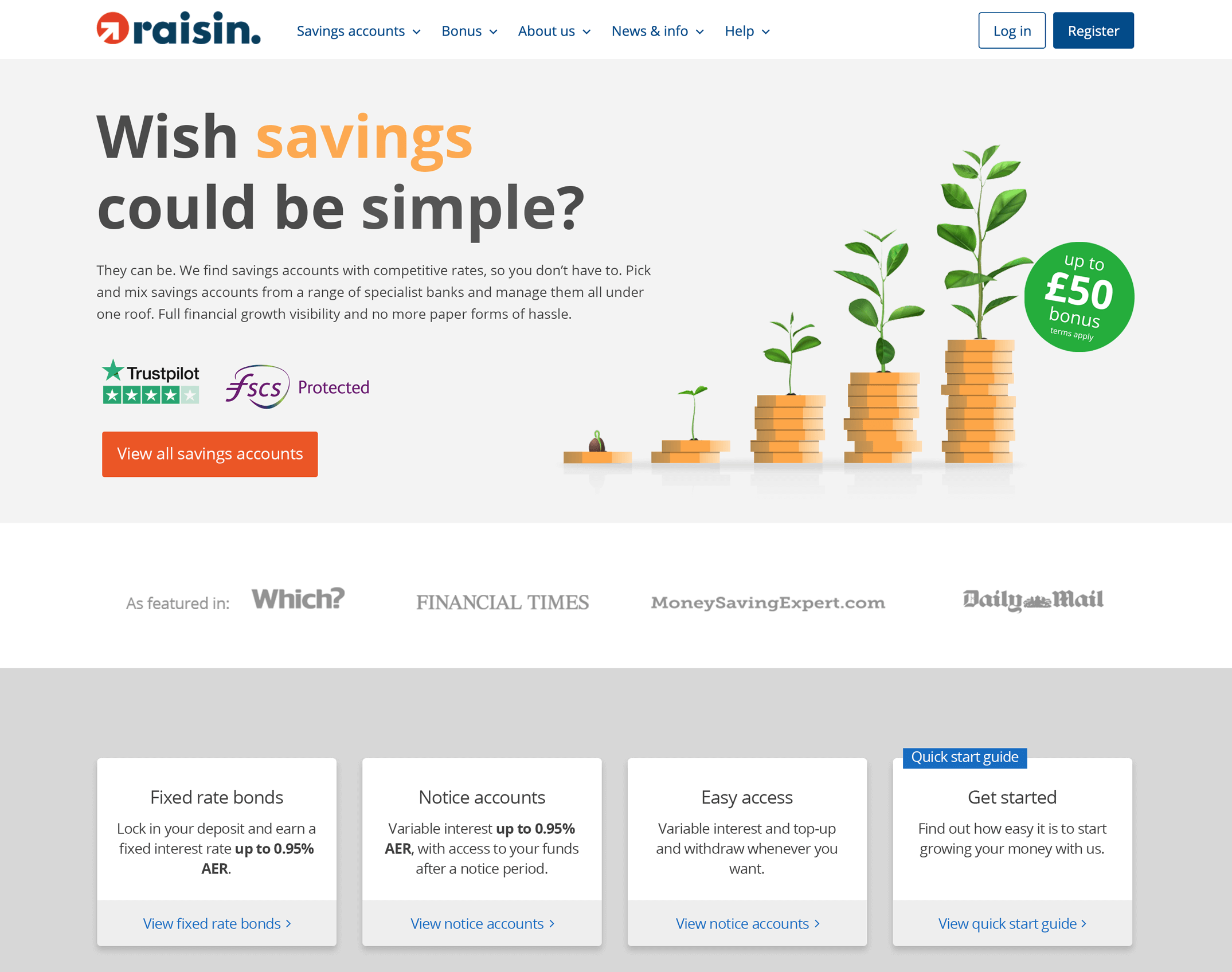
The UK homepage
The Raisin UK homepage is one of the most visited pages on their site, with around 1,000 unique visits (1,100 non-unique visits) per day. It forms a key entry point in the onboarding journey for many new users, so it is crucial that the homepage clearly communicates the brand's key proposition, instils confidence in the user and clearly explains the savings products on offer. This is particularly true for a brand which is a relative newcomer in the UK savings space and not yet a familiar name for many UK savers.
The UK homepage UI/UX had been established through user-testing during Raisin UK's first year.
What we have learnt so far
- Displaying engaging lifestyle imagery in the hero reduced the bounce rate for prospects
- Using seasonal lifestyle imagery in the hero helped reduce bounce rates even further
- Featuring one prominent brand proposition in the headline increased CTR
- Featuring one primary CTA 'View all savings accounts' in the hero increased CTR (and CVR)
- Displaying the bonus offer prominently above the fold improved CVR
- Displaying product types and top interest rates available for each type near the top of the page increased CTR (and CVR)
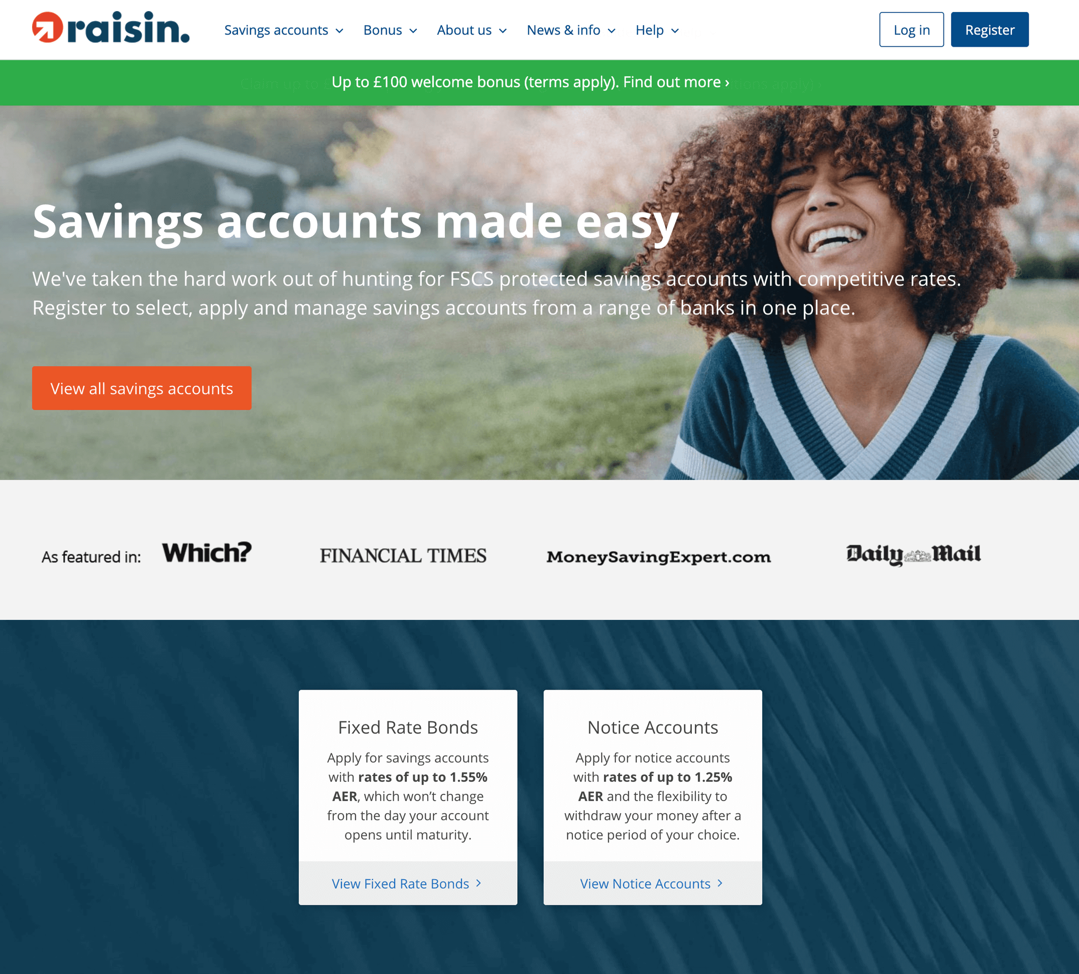
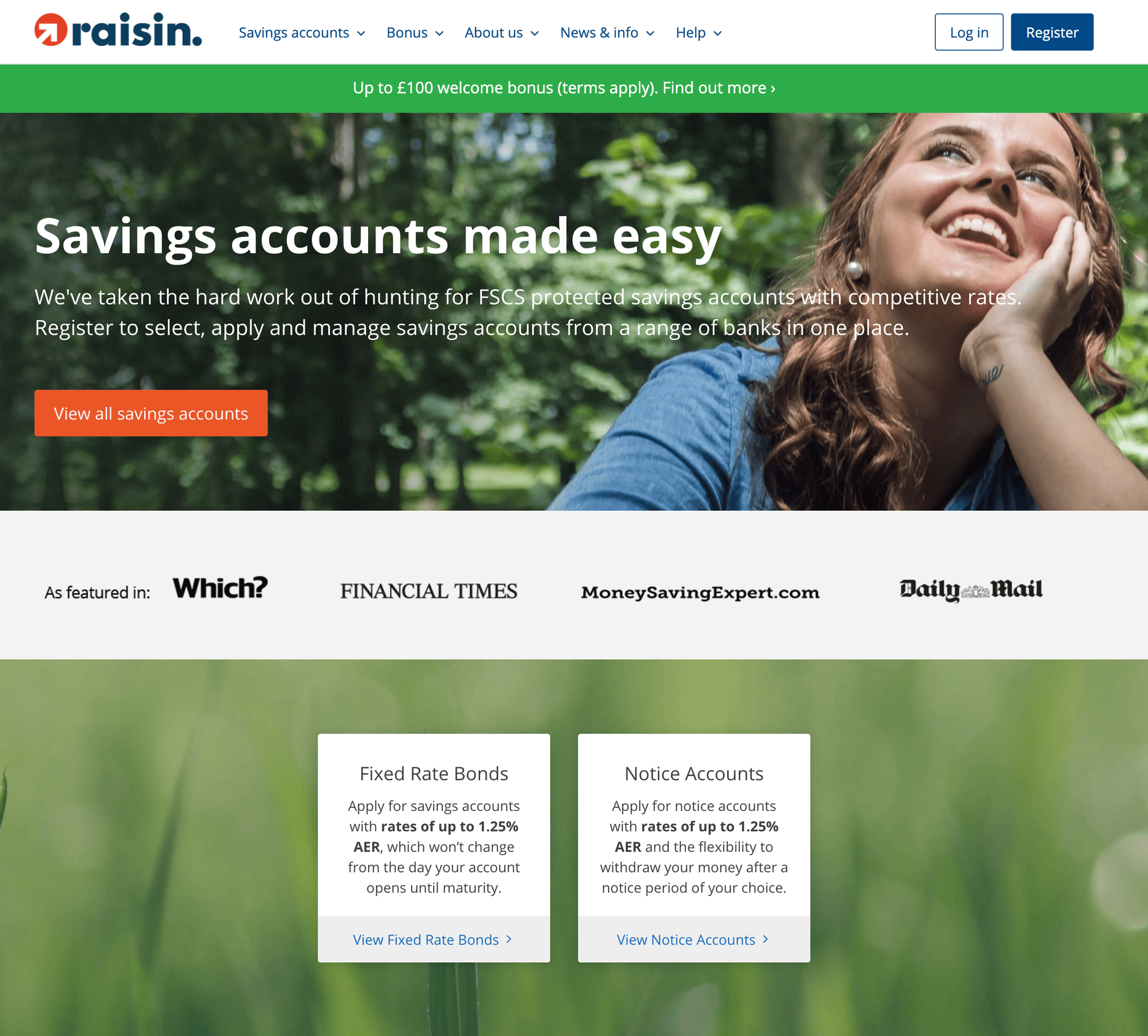
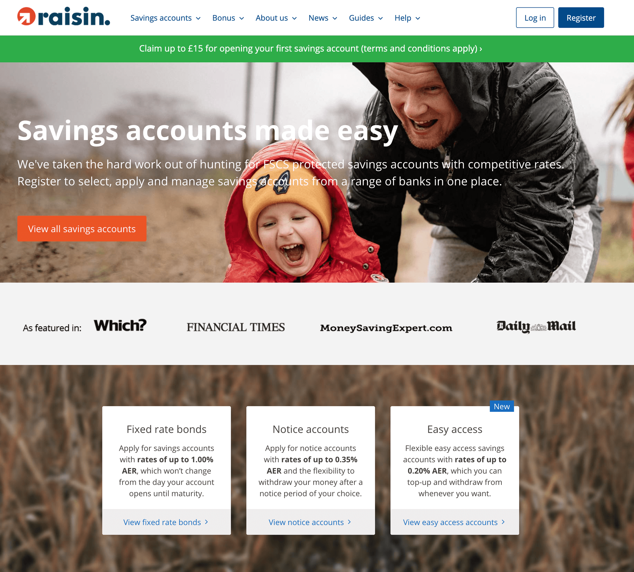
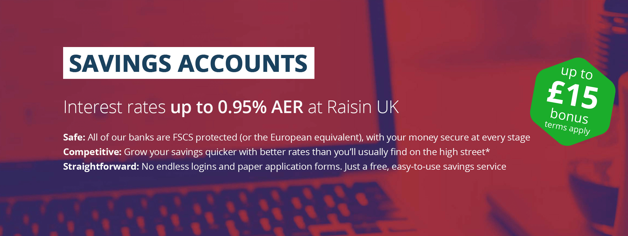
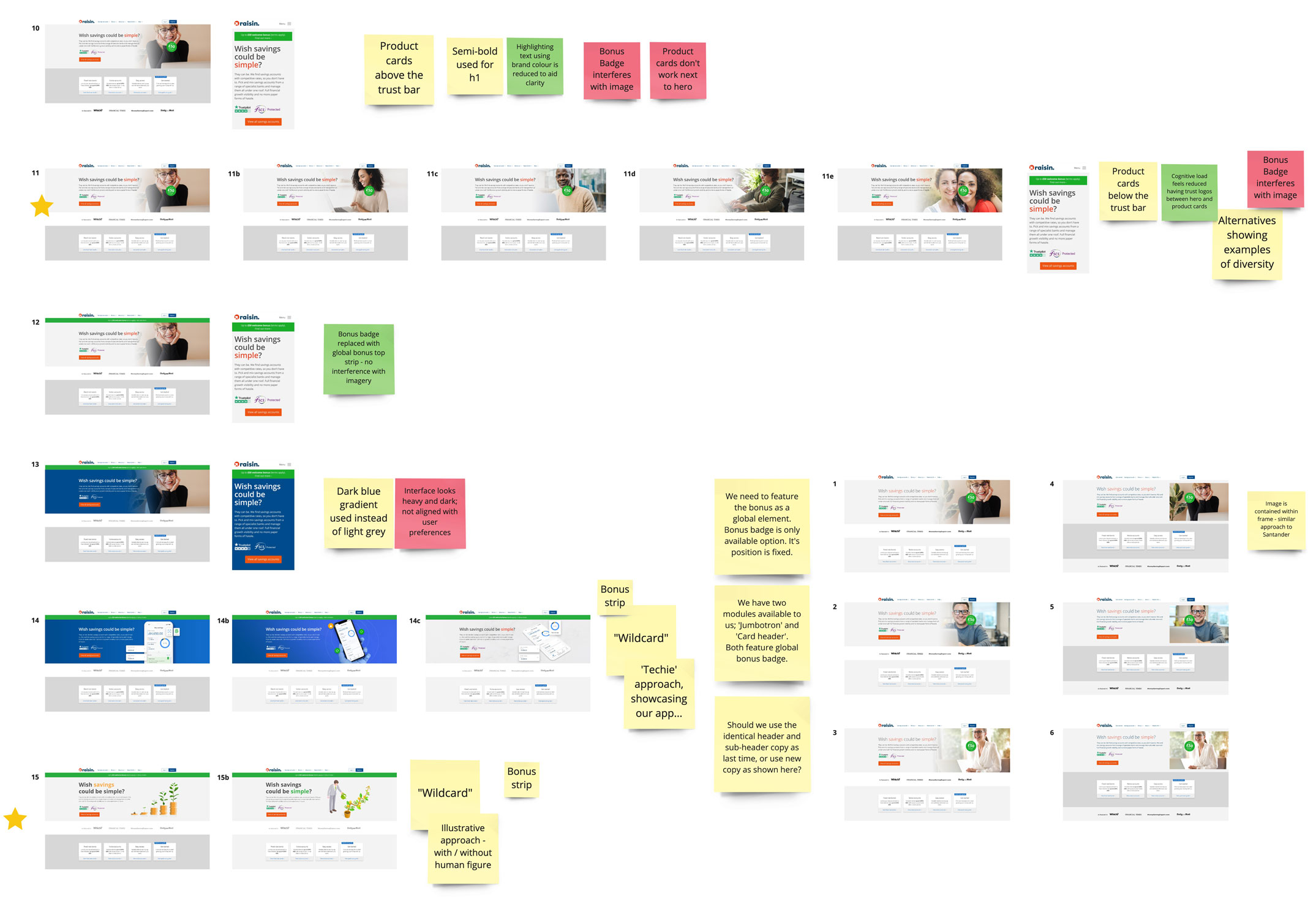
Examples of successful homepages featured on the Raisin UK website during 2020:
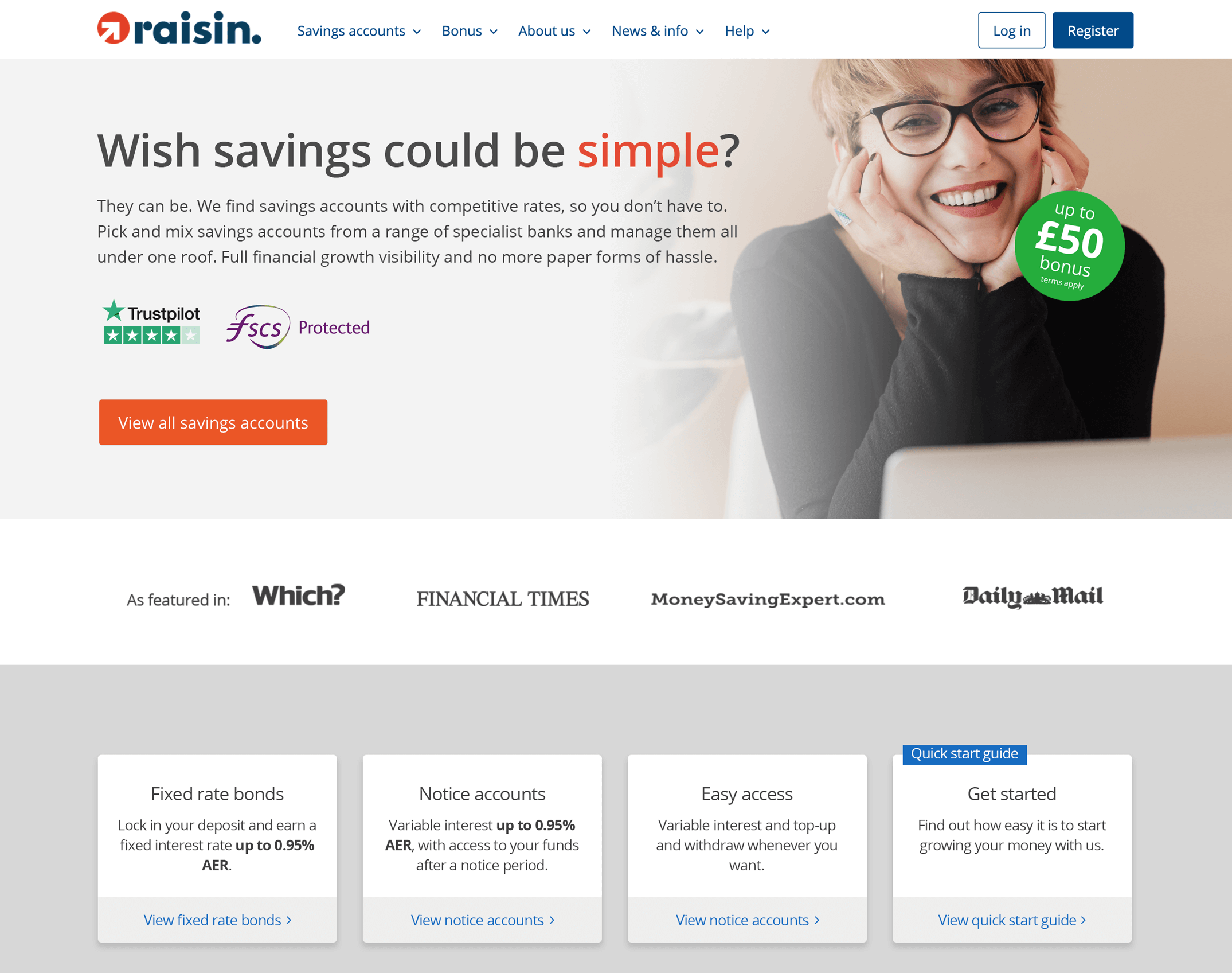
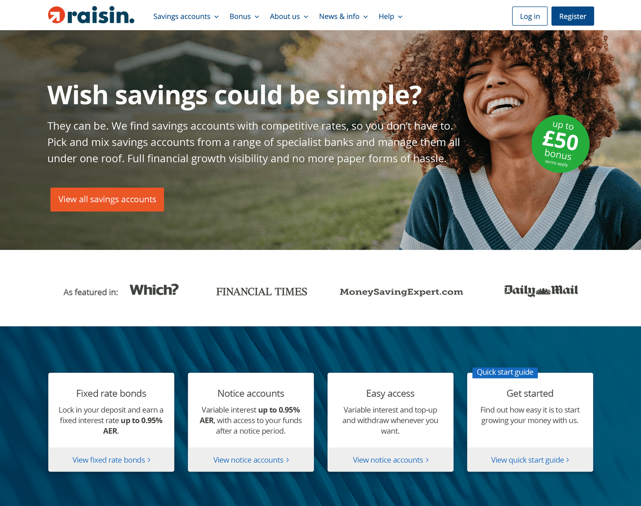
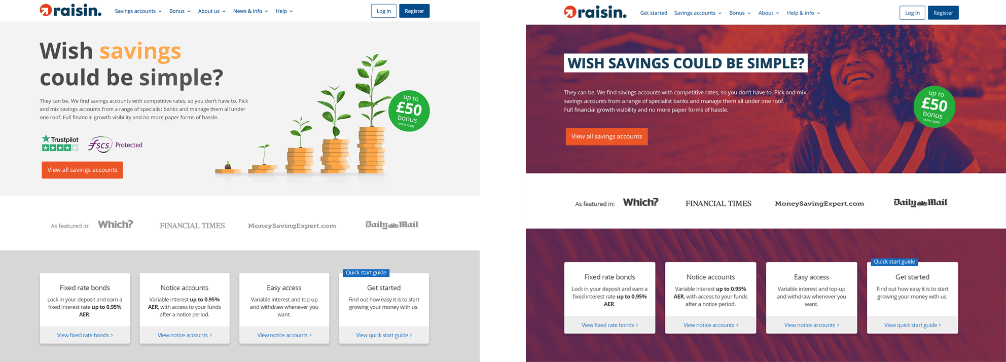
Requests from Brand Marketing
During Q1 2021 Raisin UK received a request from the Berlin-based Brand Marketing Team, asking that we align our approach to homepage hero design to match the approach being applied to the German and other European websites. Their intention was to maintain brand alignment across all Raisin platforms, requiring that UK:
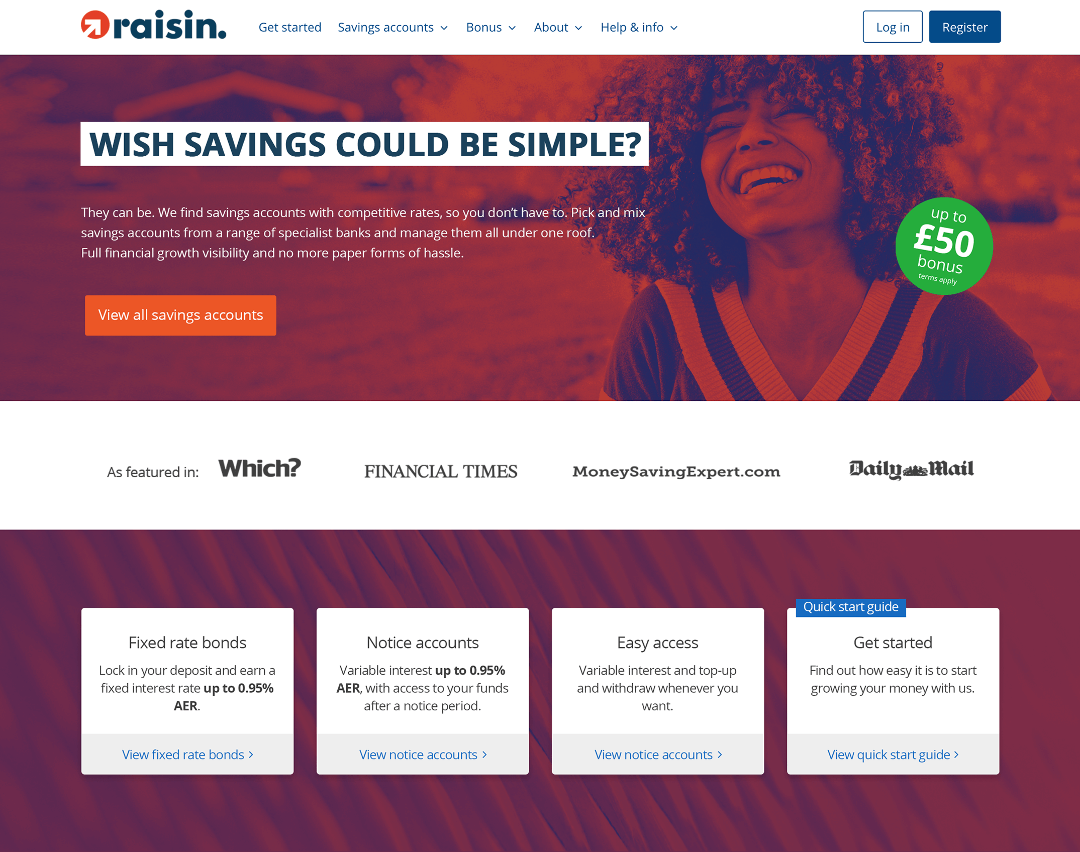
- Adopt the use of the 'campaign gradient' as a background or image overlay
- Adopt the use of the 'campaign font' (boxed uppercase) for h1 headlines
- Adopt the use of the hexagon shaped bonus badge in the hero section
Although the request for brand alignment seemed reasonable, in order to implement it, UK would have to abandon some of the effective learnings we had previously implemented and also adopt several design aesthetics which in our gut, felt inappropriate or alien to our UK audience.
| campaign gradient | |
| #212963 | #b74031 |
Challenging brand assumptions with our hypothesis
Diverging sufficiently from 'Brand's' European design aesthetics, in order to present a home page which appeals specifically to a UK target demographic will inspire confidence and trust in prospects, improve CTR and drive registration and conversion rates on the UK platform.
![]() Date: 2021
Date: 2021
![]() Role: UX/UI Research & Design, WordPress CMS · Permanent
Role: UX/UI Research & Design, WordPress CMS · Permanent
![]() Team: Brand Marketing Team Lead (Berlin), Head of Marketing (UK), Senior E-Commerce Manager (UK), Digital Marketing Manager (UK)
Team: Brand Marketing Team Lead (Berlin), Head of Marketing (UK), Senior E-Commerce Manager (UK), Digital Marketing Manager (UK)
1. Surveying existing customers
So our hypothesis challenged the alignment requests from 'Brand', but to prove that our concerns were valid or otherwise, we needed to gather qualitative / quantitive data. We firstly agreed with the Brand Marketing Team that we should test their proposals in our UK marketplace to ensure suitability. The first task was to survey our existing customers and get their feedback. I mocked up LOOKS of UK homepages using the design approach proposed by 'Brand', to compare directly with the natural LOOKS which we currently used in UK.
The survey was sent to 18,000 registered customers and ran for 14 days, receiving 1,107 total responses & 1,085 complete responses.
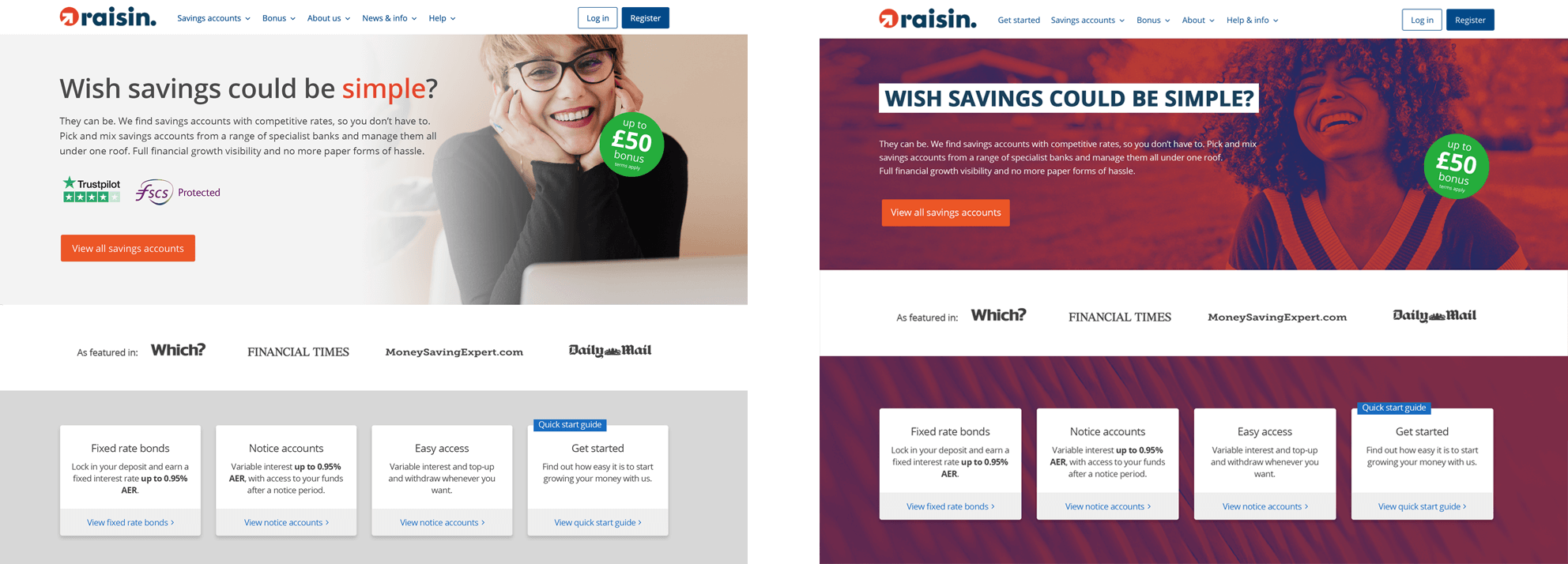
Question 1:
Which of these two looks do you think works better on the Raisin UK website?
Comparing the Campaign gradient background vs Natural background
Looks
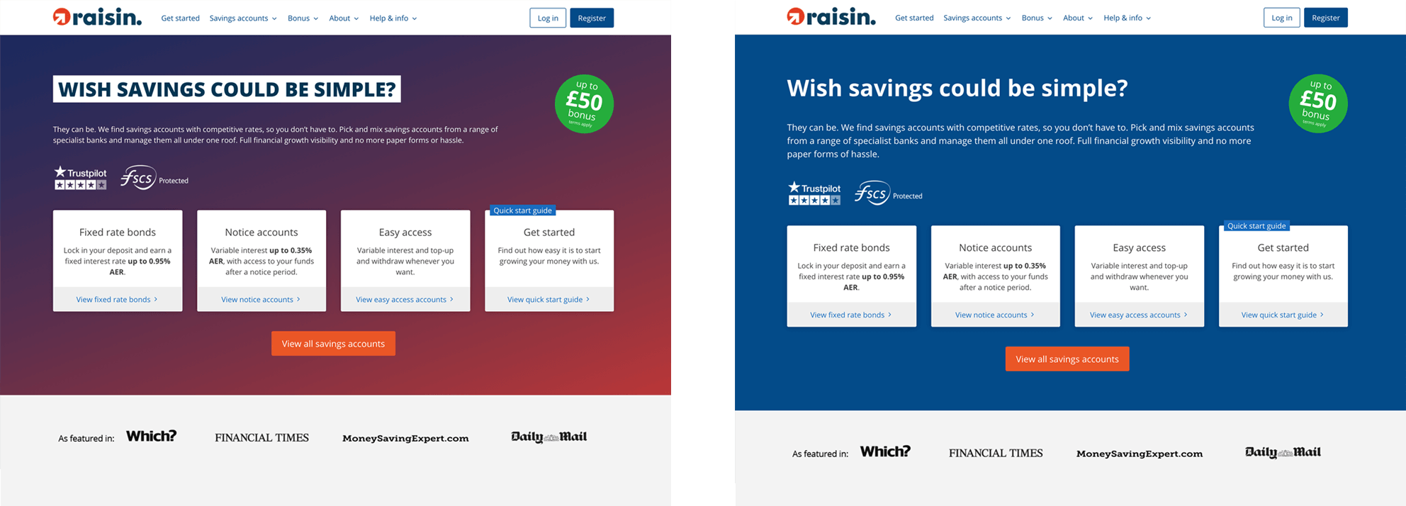
Results
| Looks | Responses | Total |
|---|---|---|
| Campaign gradient background | 30.26% | 335 |
| Natural background | 69.74% | 772 |
| 1,107 | ||
What our customers said
"The blue background looks more professional, softer and friendly. The title looks right, not like 'stuck on.'"
"The colours used in the first option suggest to that it is less business-like - even a little frivoloue. Finance is a serios business and I feel the website should reflect that."
"Easier to read on the plain bue background. The other gradient background is definately distracting from the text and the offerings."
"Blue looks classier and is more in-line with a financial site."
"The blue background is easier to read and more 'soothing' than the other one."
"I really don't like the 'shouting' headline in the red one."
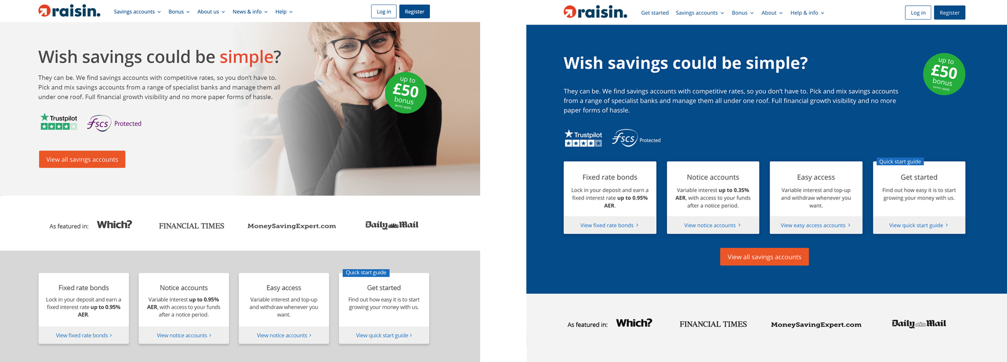
Question 2:
Which of these two looks do you think works better on the Raisin UK website?
Comparing the Campaign gradient overlay vs Natural photography
Looks
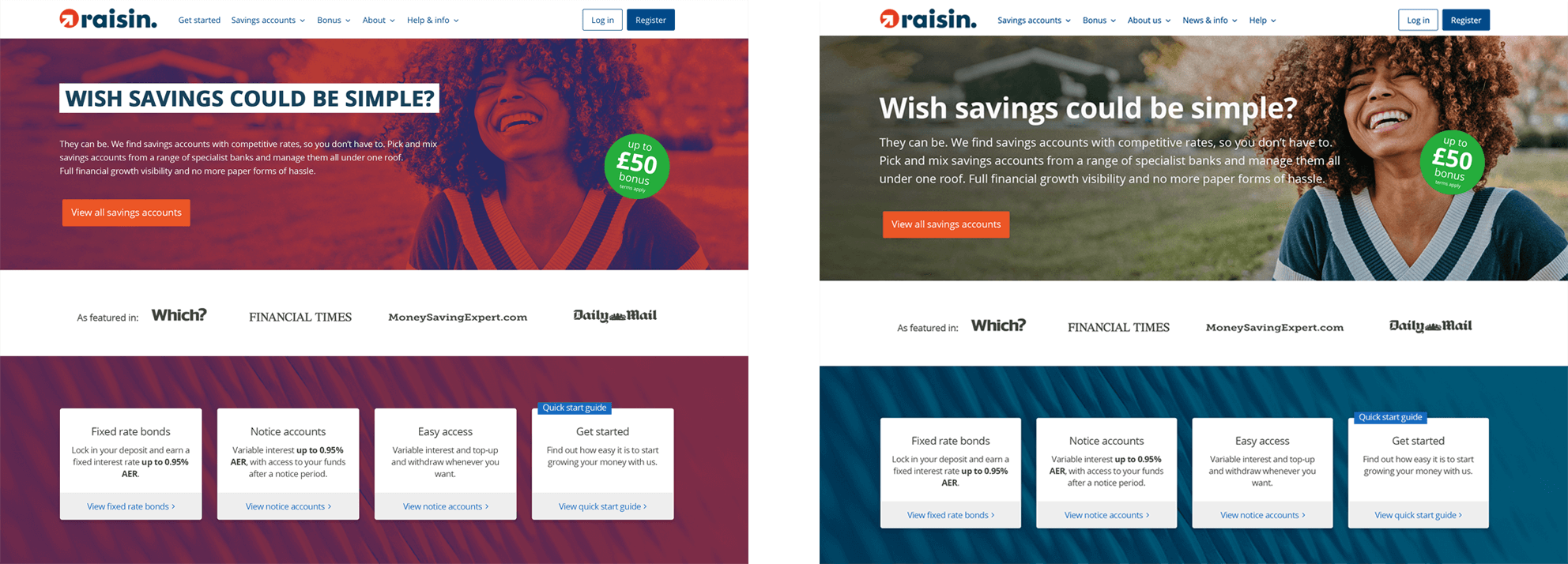
Results
| Looks | Responses | Total |
|---|---|---|
| Campaign gradient overlay | 9.94% | 110 |
| Natural photography | 90.06% | 997 |
| 1,107 | ||
What our customers said
"Looks really odd to have a picture of someone with a background that is not full colour. Looks like the website has loaded incorrectly."
"The natural one looks cleaner and more professional, also the red and overall effect makes the girl look as though she's in pain."
"More relatable to see people in true colour."
"The capitalised text in the red screen feels aggressive"
"Nice to see people. The red one looks like the colour settings are wrong. A proper photo works best in my opinion."
"The normal photo is friendlier than the red."
"The normal picture is clearer using true colours and the message stands out better."
"Red variegated background is distracting."
Questions 3-7:
The next 5 questions were more specific and compared the overall Campaign gradient / Camaign font vs Natural photography / Raisin UK font:
Campaign gradient
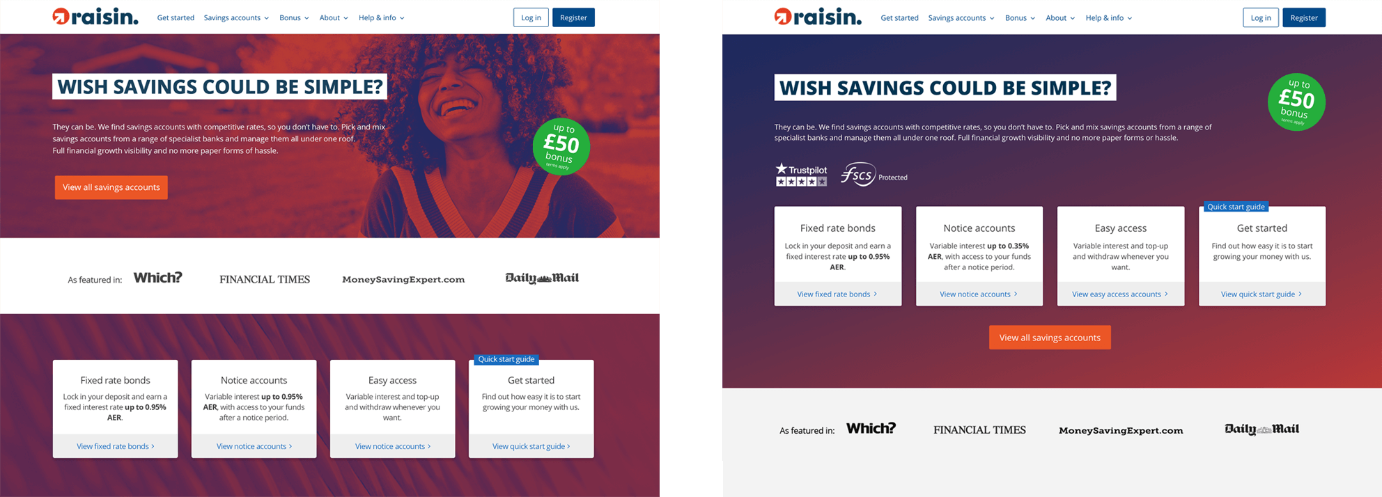
Natural
Results
| Questions 3 - 7 | Campaign gradient | Natural |
|---|---|---|
| Question 3: Which of these two looks creates a more professional impression? | 10.84% | 89.16% |
| Question 4: Which of these two looks creates a friendlier impression? | 9.49% | 90.51% |
| Question 5: Which of these two looks creates a more optimistic impression? | 10.57% | 89.43% |
| Question 6: Which of these two looks feels more current and up-to-date? | 26.74% | 73.26% |
| Question 7: Which of these two looks is clearer to see? | 9.03% | 90.97% |
What our customers said
"Images should be crisp and professional. Quirkiness is not appropriate for a financial institution."
"I don't like the gimmicky red colours and shades. Looks unprofessional, not trustworthy."
"No fuzzy backgrounds, use strong colours on a pale background."
"Clear, uncluttered, straightforward and relevant".
"Use reassuring, friendly images to elicit confidence in choosing Raisin."
"I don't especially mind as long as the text is clear to read. Some colours just don't lend themselves to that, especially graduated colour changes."
"The clearer the info stands out, the more likely I will read it."
"The headline on the red versions looks aggressive."
Question 8:
Which of these two bonus promotion element do you prefer?
Comparing the hexagonal badge used by 'Brand' vs the circular badge used by UK marketing
Bonus promotion elements


Results
| Bonus promotion element | Responses | Total |
|---|---|---|
| Hexagonal badge | 41.64% | 461 |
| Circular badge | 58.36% | 646 |
| 1,107 | ||
What our customers said
"I prefer the circular shape. The other one looks cheap."
"I am used to seeing and noticing offers in circles."
"The circle looks less awkward and conveys the impression of a 'round deal'."
"More believable as more currently seen in a round shape."
"The circle is better. I can concentrate on the message and not on the shape."
"The circle is to the point and very much less 'gimicky' than the other shape."
"The circle is what I would expect to see from a bonus offer."
"I'm used to seeing circular images for such things. The angular shape is less eye-catching somehow."
Question 9:
Which financial services websites do you like the look of and what do you like about them?
Understanding what Raisin UK customers liked most about the look of their favourite financial services websites
Preferred UI elements
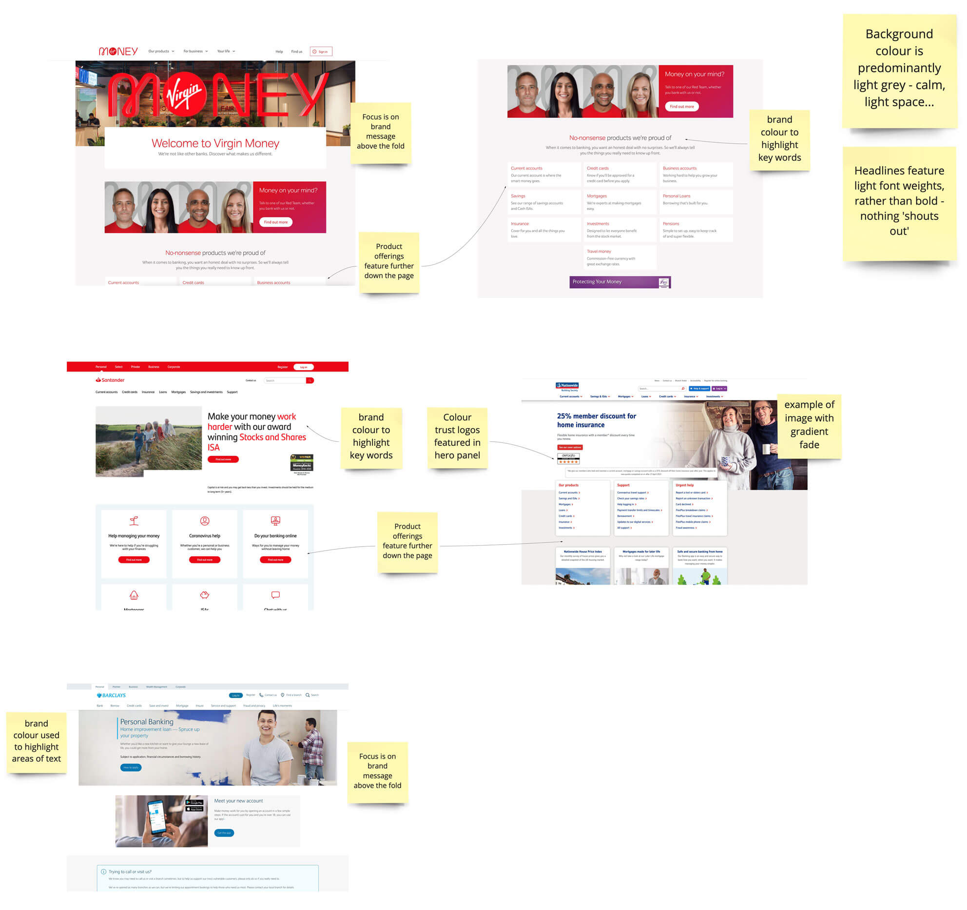
The answers were interesting and from amongst all of the feedback, 7 financial services websites proved most popular to Raisin UK customers. Each of the 7 shared similar UI elements and these similarities were expressed as preferable features by our customers:
- The use of white and light grey for backgrounds to create a calm 'environmnet'
- A clear focus on brand proposition above the fold
- Product offerings featuring further down the page, outside the hero section
- The use of a brand colour to highlight key-words in the headline
- The use of trust elements in the hero to inspire confidence in the brand
- The use of clear imagery / photography, without distracting backgrounds
The use of these common UI elements fed into our survey results, helping us establsh a new set of design principles which supported our hypothesis and provoked our next round of research
Preferred user interfaces
Concluding the survey
The quantitive data collected in the survey supported our hypothesis, that the design approach being suggested by 'Brand' (use of 'campaign gradient', 'campaign font' and hexagonal bonus badge) were not favoured by our UK audience.
We condensed the vast amount of qualitative feedback we had received in response to the 9 questions (above) and established 5 overarching principles, which would guide our approach to UK homepage hero design going forward.
Our 5 overarching principles:
- Backgrounds should be clear, light and simple
(Avoid dark imposing backgrounds. Create a calm environment where users can focus on content) - Avoid distractions
(Maintain a clutter-free UI with clear, friendly photography) - Highlight interest rates and offers clearly and appropriately
(Use design elements which feel familiar) - Avoid the use of block capitals for titles
(It feels it too 'shouty' and aggressive. Sentence case is friendlier and easier to read) - Consider accessibility guidelines
(Users who experience colour-blindness and other visual impairments may struggle with the legibility of text overlaying complex images)
Insight
So, we had gained a huge amount of insight into the preferences of our existing UK customers, but the opinions of this audience could well have been influenced by their prior exposure to and familiarity with using the Raisin UK website.
Next steps
The next step would be to survey prospects in UK; people who are not Raisin UK customers and have likely not previously seen the UK website. This is the audience to whom first opinions are of primary importance to Raisin.
2. Surveying non-Raisin UK customers
Establishing the survey content
I ran an ideation workshop with stakeholders from UK teams, exploring ideas based around our pre-established '5 overarching principles'. This informed a series of mockups featuring a light grey background, clear, friendly photography and some 'wildcard' alternatives which featured a clean, dark blue background, Raisin app-based foreground imagery and illustrative foreground imagery.
We also explored alternative ways to present the bonus promotion. The green badge was a global element and its position was fixed within the user interface, almost always obscuring the underlying homepage imagery. As an alternative, To resolve this, I wanted to test a green bonus strip sitting below the navigation header; a mechanism which generally proves successful and familiar on e-commerce websites.
Two firm favourites emerged from the workshop (one with a photographic background (E-1) and one with an illustrative background (F1) (see below).
These would form part of the following survey to non-Raisin UK customers.
The actual survey to non-Raisin UK customers
The survey was sent to 500 UK prospects (Non Raisin UK customers, who were principally interested in dealing with topics of finance and/or wealth building). 50% were male, 50% were female. The complete survey contained the following 6 'LOOKS'. The 4 which we had tested perviously with existing customers, plus the two designs established in the ideation workshop:
The 6 'Looks'
A-1
C-1
E-1
B-1
D-1
F-1
Statement 1:
This brand seems professional and trustworthy. I would feel comfortable trusting this company with my money.
F-1: Best rated - A-1: worst rated
Results
| LOOK | Strongly/somewhat agree | Strongly/somewhat disagree |
|---|---|---|
| A-1 | 53% | 11% |
| B-1 | 57% | 7% |
| C-1 | 57% | 9% |
| D-1 | 56% | 8% |
| E-1 | 65% | 6% |
| F-1 | 65% | 6% |
Statement 2:
This brand seems easy and hassle-free. I think using their service would be easy.
E-1: Best rated - A-1: worst rated
Results
| LOOK | Strongly/somewhat agree | Strongly/somewhat disagree |
|---|---|---|
| A-1 | 60% | 8% |
| B-1 | 67% | 6% |
| C-1 | 63% | 6% |
| D-1 | 65% | 5% |
| E-1 | 71% | 4% |
| F-1 | 71% | 5% |
Statement 3:
This brand seems friendly - I think they would be friendly and approachable if I had to speak to them directly.
E-1: Best rated - D-1: worst rated
Results
| LOOK | Strongly/somewhat agree | Strongly/somewhat disagree |
|---|---|---|
| A-1 | 60% | 9% |
| B-1 | 71% | 5% |
| C-1 | 56% | 13% |
| D-1 | 54% | 7% |
| E-1 | 75% | 3% |
| F-1 | 70% | 4% |
Statement 4:
This brand seems modern - I think the service they are offering would be innovative and modern.
F-1: Best rated - A-1: worst rated
Results
| LOOK | Strongly/somewhat agree | Strongly/somewhat disagree |
|---|---|---|
| A-1 | 64% | 8% |
| B-1 | 70% | 7% |
| C-1 | 62% | 11% |
| D-1 | 65% | 10% |
| E-1 | 73% | 5% |
| F-1 | 74% | 5% |
Preference questions:
Which of the homepage designs (LOOKS) would you most like to see on the Raisin UK website?
Look Preferences
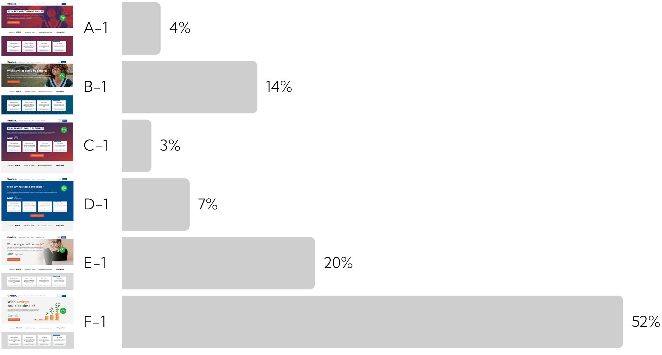
The quantitative data indicated a clear preference for LOOK F-1. This design also either won, or rated very highly for each of the 4 preceding statements.
Which of the bonus promotion element design do you prefer?
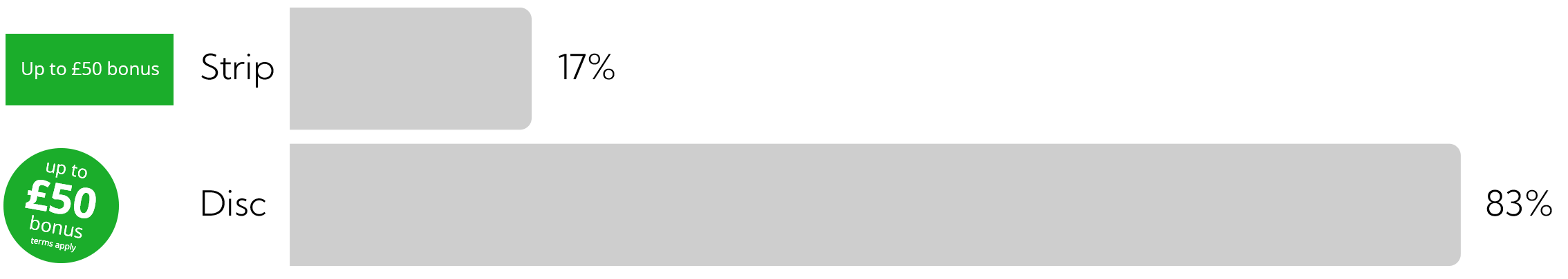
Compared to the bonus strip, the bonus disc scored better across the board.
Qualitative feedback
Some comments relating to F-1, the most preferred LOOK.
"Visually clean and simple - strong use of reliable aliances (Which etc)."
"its clear, concise, easy to understand and more eye catching and it also looks different to other finamcial advertising."
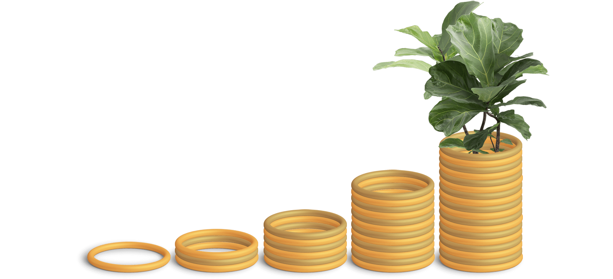
"Clearer, lighter look. Emphasises savings more and fscs/trustpilot stands out more. Prefer symbol of tree growing as hope savings growing rather than attractive female picture. If meant to show friendliness, what is wrong with older female or male young or old?"
"Organic and natural. No woke people politics going on."
"Images of growth no gender or race bias nice fresh clean image."
"I prefer reading the information that’s got a white or light background. The acorn money tree savings caption is good. The FSCS Protection and TrustPilot logos are positive."
"it is the most conservative of the images, and the image is of more interest."
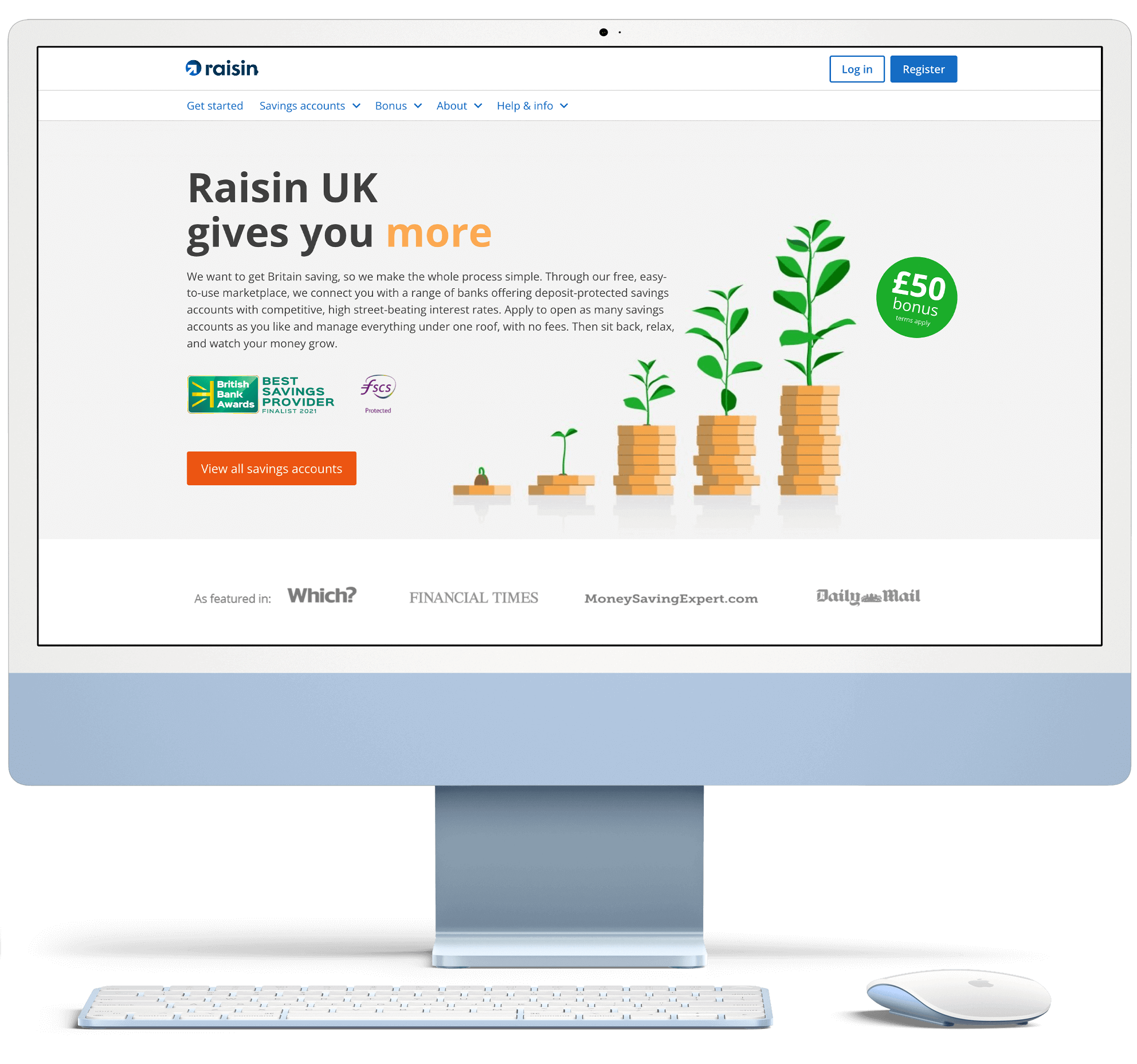
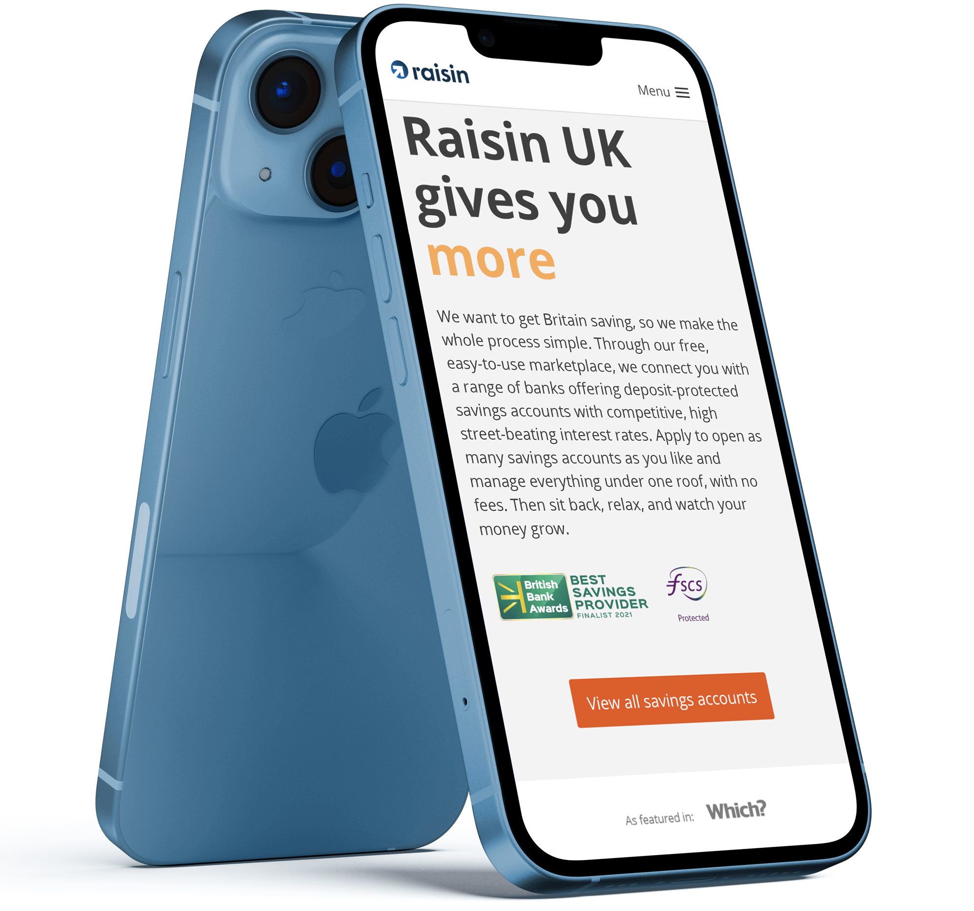
The solution
A high-performing homepage
The final solution was a high-performing homepage which was overwhelmingly received by our target demographic as professional, trustworthy, innovative and modern. After launching the new homepage in Q3 2021, we saw:
- An increased click-through rate of 258% from the homepage hero CTA: 'View all savings accounts'
(480% on mobile, 178% on tablet, 180% on desktop) - An increase in registrations on the platform, with a corresponding increase in conversion
Desktop
Mobile
Want to know more?
If you would like to know more about my work, or have a new opportunity you want to share with me,
please email: