 Magic Element | Portfolio of Dan Rodrigues
Provider Cloud UI & UX

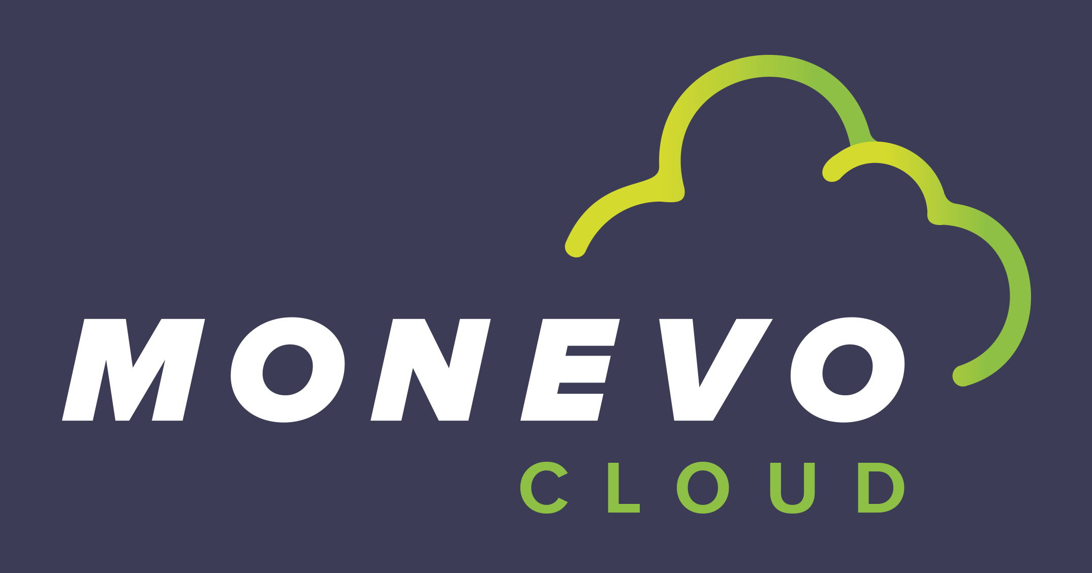
Monevo
Established in 2016, Monevo operates across the UK, US, and Australia, boasting a workforce of over 100 employees. Their platform and solutions empower more than 150 credit providers to efficiently manage and distribute personalised credit offers, optimising and expanding their customer base. Monevo also facilitates brands in integrating highly tailored credit comparison and search functionalities within their own websites and apps. Co-owned by Quint Group and TransUnion, Monevo stands as a prominent figure in the industry.
In May 2022, Monevo hired me to craft the user interface and user experience for their innovative, new 'Provider Cloud' platform. I was also tasked with designing a new brand logo for 'Provider Cloud'.
![]() Date: 2022
Date: 2022
![]() Role: UX/UI Design, Logo design · Remote freelance contract
Role: UX/UI Design, Logo design · Remote freelance contract
![]() Direct reports: Monevo Chief Innovation Officer (CIO), Monevo Head of Technology (UK)
Direct reports: Monevo Chief Innovation Officer (CIO), Monevo Head of Technology (UK)
What is 'Provider Cloud'?
The pioneering 'Provider Cloud' project offered me an exciting opportunity to help shape Monevo’s cutting-edge digital solution, which allows lending institutions to create their own lending rules, rulesets and scorecards, enabling automatic filtering and scoring of loan and finance applicants. The Provider Cloud, a groundbreaking product upon its release.
Confidentiality agreement
My confidentiality agreement with Monevo prevents me from publishing a detailed account of the research and design work I undertook on the project. The functionality offered by ‘Provider Cloud’ was unique to Monevo at the time of launch. The platform also sits behind a log-in gate and is intended only for those who have subscribed to the service. However, I can provide a summary of the work I've engaged in and the design logic and thought processes driving my design of the logo, which was intended for the public domain.
Designing the user interface
When I joined the project, the teams at Monevo had already completed a lot of the technical research and had established various sets of technical process flows. My initial task was to to assimilate these and translate them into UI flow diagrams, which would inform the user journeys and screen designs I was responsible for designing.
The flows were quite complex, but the screens needed to be as intuitive as possible, allowing users to create, save, edit, submit and delete their own lending rules, rulesets, and scorecards with comparative ease. I used an iterative design process, testing various versions of each screen and complete user journeys on an internal audience, until the most streamlined intuitive solutions were reached.
To give a flavour of the work, below are two example screens showing created rulesets.

A simple ruleset containing 1 saved, unsubmitted rule, which the user has selected to edit.
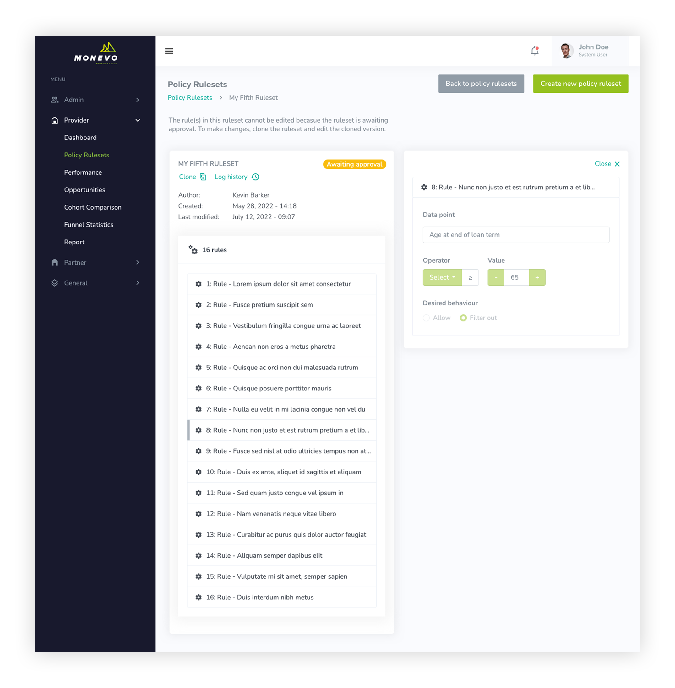
A complex ruleset containing 16 individual rules, which is awaiting approval by the administrators. User has selected to edit rule #8.
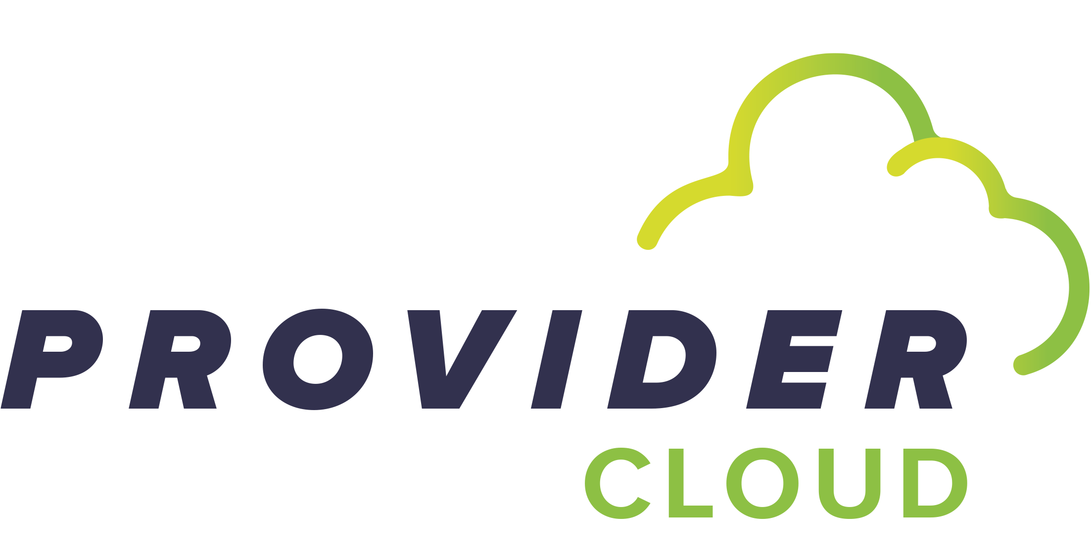
Designing the logo
Version 1: Incorporating a cloud
My initial brief to design a logo for the new Provider Cloud platform required a design which incorporated the existing Monevo 'Money Evolved' branding and a cloud shape. After producing a few experimental sketches, it became obvious that a design which included both the arrows from the existing Monevo logo and a new cloud outline combined too many elements, therefore my first proposal was to replace the arrows with a new cloud outline and rely upon the existing Monevo lettering to provide brand continuity.
My first round of design variations were based around a universally recognisable cloud shape which I wrapped around the Monevo lettering, to symbolise the fact that the Monevo 'Provider' services are 'in' the cloud.
I constructed the cloud outline using the same stroke width, corner radius and spacing values as those used to build the arrows in the existing Monevo 'Money Evolved' branding, helping to maintain the relationship of continuity between the existing brand logo and the new Provider Cloud logo.
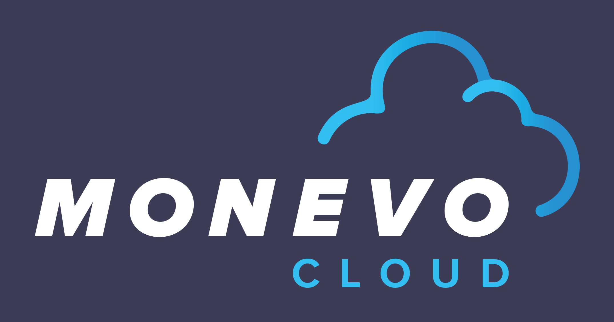
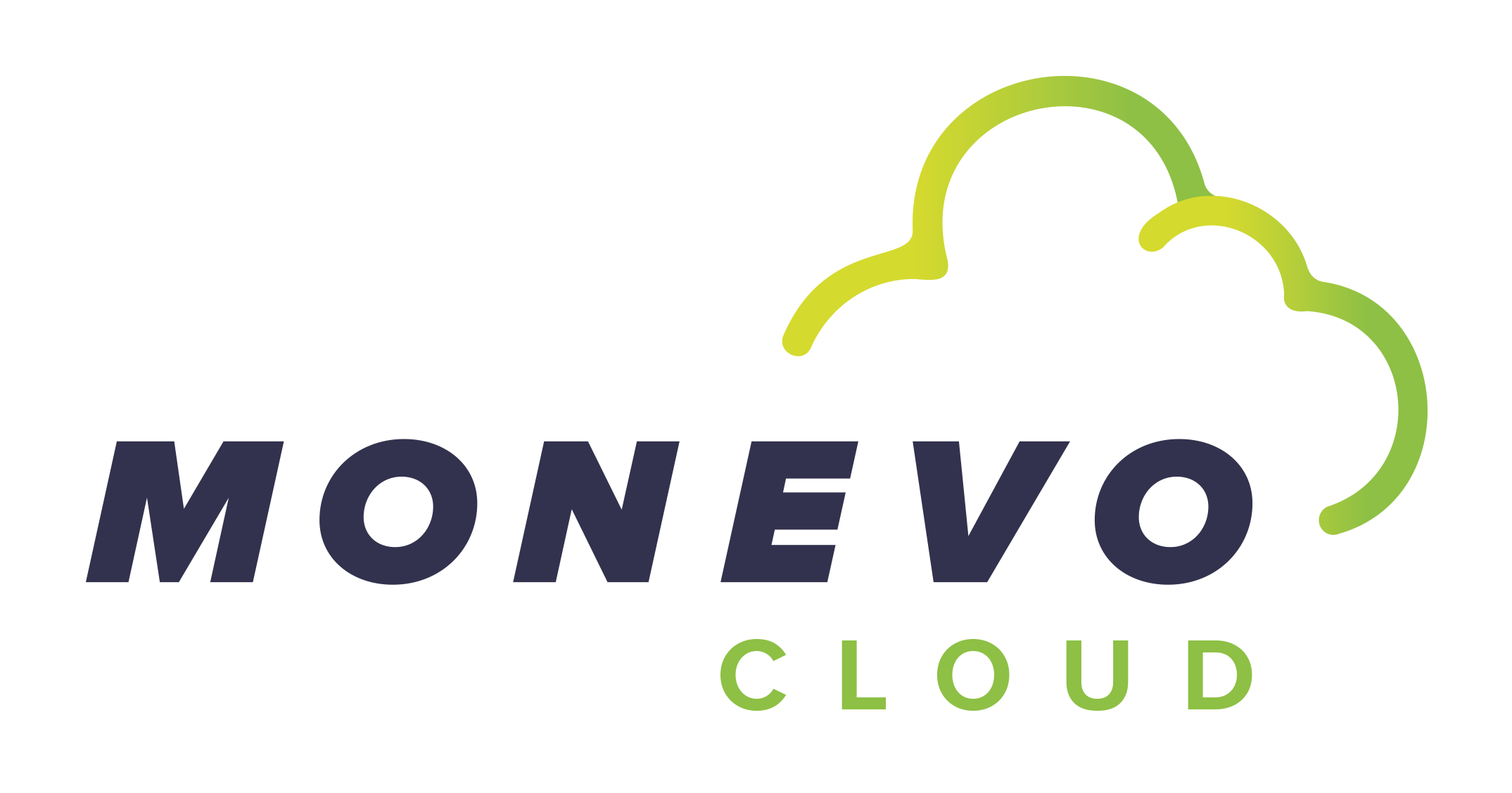
Existing Monevo logo / New Monevo Cloud logo
Colour
Monevo’s colours are intended to complement each other and give off the idea of collaboration, growth and innovation. To do this, they base their main colour schemes around natural colours including greens and blues. Taking my lead from this, the colour gradient I used to define the cloud used two blues which have the same chromatic relationship to one another as the two greens used for the arrows in the main Monevo 'Money Evolved' branding. I retained 'Navy 01' for the lettering.

| Blue gradient | |
| #02C2F3 | #0093D8 |
| Navy 01 | |
| #3C3C56 | |
| Green gradient | |
| #DDDB20 | #8DC63F |
Perfectng the cloud shape
The shape of the cloud evolved through three phases:
- A smooth, single stroke with a single blue gradient
- Inspired by the overlapping arrows in the existing Monevo 'Money Evolved' logo, I introduced a layered stroke, still with a single blue gradient
- More closely echoing the double, overlapping arrows, I used a double blue gradient to define the layered stroke
Logo v1.0 - Initial proposals
At the request of the client, I presented two options for version 1; one featuring the new blue gradients and the second using the original green gradients used in the existing 'Money Evolved' logo.
Logo v2.0 - Emphasising the new name
Favouring the green gradient option, my second version of the logo included the new cloud shape, but changed the emphasis of the wording to promote 'Provider Cloud'. To maintain brand continuity, I retained the original fonts, colours and letter spacing used in the existing Monevo 'Money Evolved' logo.
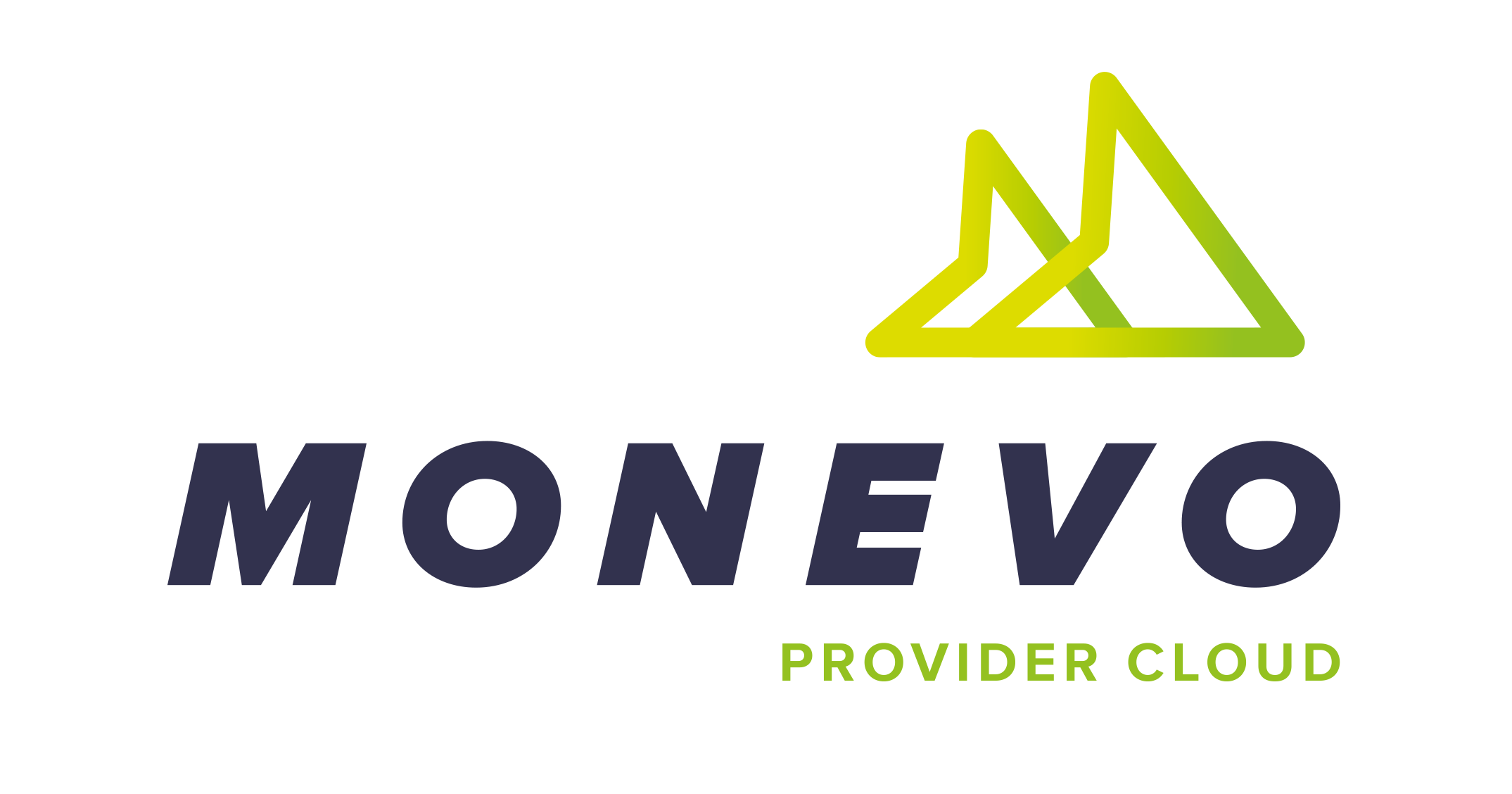
Logo v3.0 - Reverting to the familiar
The third and final version of the logo was a bit of a u-turn. Fearing that the introduction of the cloud image at the expense of losing of the double-arrow image could confuse existing customers who already had familiarity with the current Monevo branding, the client requested that the arrows were reintroduced. The only differentiation between the original 'Money Evolved' logo and the new 'Provider Cloud' logo being the wording used.
Want to know more?
If you would like to know more about my work, or have a new opportunity you want to share with me,
please email: